Bradley Braves
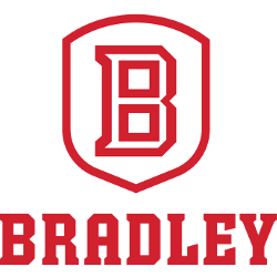
A white with red trim shield with the letter “B” in white with a red outline above a wordmark “BRADLEY” in red. Designed by Joe Bosack.
Braves Wordmark Logo
The Bradley Braves is a college basketball team that competes in the NCAA Division I. The team has a rich history, and its wordmark logo is an important part of this legacy. In this blog post, we’ll take a look at the history of the Bradley Braves wordmark logo and how it has evolved over time.
The original Bradley Braves wordmark was created in 1948 when they first joined the Missouri Valley Conference (MVC). It featured bold red lettering with white outlining on either side of each letter spelling out “Bradley” above “Braves” written underneath it all in capital letters. This design remained unchanged for more than 40 years until 1989 when they updated their primary mark to better reflect modern aesthetics while still keeping true to its roots as well as honoring their Native American heritage which had been represented by an arrowhead since 1934.
This new version kept many elements from before but added some subtle changes such as lowercase lettering instead of capitals along with thicker lines on both sides creating what appears to be two arrows pointing up towards each other symbolizing strength and courage - values that are closely associated with Native Americans throughout history making it even more meaningful for fans today who recognize these qualities within themselves or those close them who may have served our country proudly as so many brave men & women have done before us! Additionally, there were also slight modifications made regarding font size/style which gave off an overall cleaner look compared to its predecessor thanks largely due too advances in technology during this period allowing designers greater flexibility when crafting logos from scratch without having to worry about limitations imposed by traditional methods used prior (i..e hand-drawings).
Today's version features brighter colors including yellow accents around certain parts which helps bring attention back onto key aspects such as "Braves" being placed higher up than "Bradley," further reinforcing symbolism behind arrows mentioned earlier; however most notably perhaps would be addition blue outline found along edges giving entire image much-needed contrast against background thus providing viewers something visually appealing yet still recognizable enough so anyone can easily identify organization just glancing at any given moment no matter where located geographically speaking! All said though regardless of what form takes one thing remains constant: the love shared between players and alumni alike will never fade away no matter how long pass nor ever forget the commitment put forth every game day represents the university's best light possible both home and court away courtside stands across the nation world wide web...Go BRAVES.
Bradley Braves
2012 - Present
A wordmark "BRADLEY" in red.
Designed by Joe Bosack.
Font: Serif
https://www.dafont.com/theme.php?cat=502