Loyola Ramblers
A yellow with the white and red trim letter “L” next to a wolf’s head in black and grey.
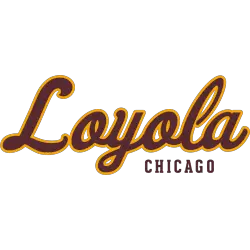
Loyola Ramblers
2019 - Present
A scripted wordmark "Loyola" in maroon with gold highlights and CHICAGO" in maroon.
Font: Custom
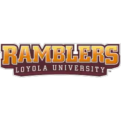
Loyola Ramblers
2012 - 2019
A wordmark "RAMBLERS" in yellow with white trim on a red outline background and "LOYOLA UNIVERSITY" in white on a maroon background.
Font: Custom

Loyola Ramblers
2012 - 2019
A wordmark "RAMBLERS" in gold with white highlights on a formed maroon background.
Font: Custom

Loyola Ramblers
2003 - 2012
A wordmark "LOYOLA UNIVERSITY CHICAGO" above an arched "RAMBLERS" is all in black.
Font: Unknown
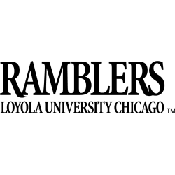
Loyola Ramblers
2003 - 2012
A wordmark "RAMBLERS" above "LOYOLA UNIVERSITY CHICAGO" is all in black.
Font: Unknown
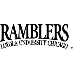
Loyola Ramblers
2003 - 2012
A wordmark "RAMBLERS" above an arched "LOYOLA UNIVERSITY CHICAGO" is all in black.
Font: Unknown
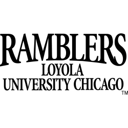
Loyola Ramblers
2003 - 2012
A wordmark "RAMBLERS" above "LOYOLA UNIVERSITY CHICAGO" is all in black.
Font: Unknown
Loyola Ramblers Logo History
Early variations of the Loyola Ramblers Wordmark logo relied on classic lettering and simple strokes that reflected the school’s early athletic identity. Over the years, designers introduced stronger lines and updated spacing to give the Wordmark a sharper appearance. You can compare these versions with the primary emblem by visiting the Loyola Ramblers primary logo page for additional context.
As the program expanded, newer designs introduced a modern typography style that aligned more closely with the evolving Loyola Chicago Ramblers logo. These updates created a more unified brand presence across uniforms, digital layouts, and fan merchandise. Fans who want deeper historical background can explore the team’s profile on the Loyola University Chicago Wikipedia page, which supports the broader view of the Loyola Ramblers logo history found here.
Recent Wordmark updates focus on clean, bold lettering that helps strengthen visibility across different platforms. This page brings together every Loyola Ramblers Wordmark logo, giving visitors a complete look at how the team refined its identity through consistent adjustments and stylistic improvements over time.


