South Carolina Gamecocks
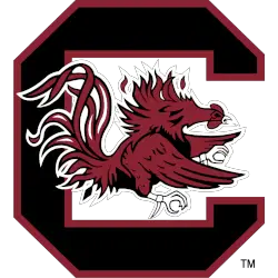
Garnet and black rooster attacking inside a block black with the garnet trim letter “C.” Rooster of the domestic chicken trained for fighting. This version with the Garnet outline on the C is white/light backgrounds only.
Gamecocks Wordmark Logo
The South Carolina Gamecocks have a long and storied history of alternate logos. The first logo was created in 1971 when the university adopted an intercollegiate athletic program. This original logo featured a rooster with its wings spread wide, perched atop the letters “SC” in bold black font. This classic design has remained largely unchanged over the years, but there have been some minor tweaks to keep it fresh and relevant for today's fans.
In 2008, South Carolina unveiled their newest alternate logo: a stylized version of their traditional mascot set against an orange background with two white stripes running across it from top to bottom. The new design incorporated more modern elements while still maintaining many aspects of the original look that fans had grown accustomed to over time; this included keeping both versions of "Gamecock" spelled out within each stripe as well as retaining certain features such as feathers on top of its head and talons underneath its feet for added detail workmanship.
Today, South Carolina continues to use these two logos interchangeably depending on what type or style they are looking for at any given moment; however no matter which one is chosen you can always count on them to represent school pride proudly! Whether you're cheering from home or attending games live inside Williams-Brice Stadium - Go Cocks!
South Carolina Gamecocks
2008 - 2018
Double lined wordmark "SOUTH CAROLINA" in black and "GAMECOCKS" in red with white and black trim.
Font: Custom

South Carolina Gamecocks
2008 - 2018
Double lined wordmark "SOUTH CAROLINA" in black and "GAMECOCKS" in red with white and black trim.
Font: Custom

