UNC Wilmington Seahawks
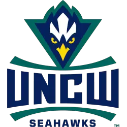
A seahawk’s head in gold, navy, and white with a green outline is above the double-arched initials “UNCW” with an upper and lower arched line and over the wordmark “SEAHAWKS” in navy.
Seahawks Wordmark Logo
As sports fans, we all know the importance of a team's logo. It represents the team's identity and history and can evoke powerful emotions in fans. One logo that has stood the test of time and holds a special place in the hearts of UNC Wilmington Seahawks fans is the wordmark logo.
The wordmark logo has been a staple for the UNC Wilmington Seahawks since the team's inception in 1947. Although it has undergone several transformations over the years, its core elements have remained the same, making it one of the most recognizable logos in college sports.
The first version of the wordmark logo was introduced in 1947, featuring the letters "UNCW" in a bold, block font with a simple underline. This logo was used for over a decade and symbolized the team's early years. In 1960, the logo underwent a slight change with the addition of a small seahawk illustration above the letters. This addition gave the logo a more dynamic and fierce look, reflecting the team's competitive spirit.
In 1973, the logo was again redesigned with a more modern and sleek font. The letters were now slanted and had a distinctive curve, giving the logo a sense of movement and energy. The seahawk illustration was updated with a more detailed and realistic depiction of the bird. This logo was used for over two decades, and during this time, the UNC Wilmington Seahawks saw significant success in various sports, including basketball, baseball, and soccer.
In 1997, the wordmark logo was given a significant overhaul, with a complete redesign that would become the basis for the current logo. The letters were now in a bold, italicized font with a sharp, angular design. The Seahawks illustration was also updated with a more aggressive and fierce stance. This logo perfectly captured the team's spirit and became an instant hit among fans.
In 2011, the logo underwent a minor update, adding a thin white outline around the letters and the seahawk illustration. This change gave the logo a more polished and modern look while maintaining its core elements.
Today, the UNC Wilmington Seahawks wordmark logo is a testament to the team's rich history and unwavering commitment to excellence. It has become a symbol of pride for the university and its fans, and it continues to inspire and unite the community.
UNC Wilmington Seahawks
2015 - Present
A double arched wordmark "SEAHAWKS" with a upper and lower arched line in navy.
Font: Custom
UNC Wilmington Seahawks
2015 - Present
A double arched initials "UNCW" with a upper and lower arched line in navy.
Font: Custom


