UNC Greensboro Spartans
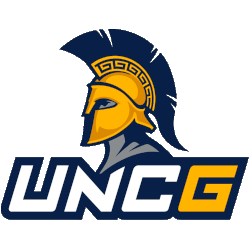
A Spartan’s head in blue and silver, wearing a gold helmet with a blue plume above the initials “UNCG,” the letters “UNC” in white, and the letter “G” in gold on a blue-formed background.
Spartans Wordmark Logo
The UNC Greensboro Spartans' wordmark logo history is a testament to the university's commitment to evolving its brand identity while maintaining a strong connection to its heritage. The wordmark logo, which prominently features the university's name and often the Spartans' name, serves as a crucial element in the overall branding strategy, providing a clear and recognizable representation of the institution. This logo has undergone several transformations over the years, each iteration reflecting the changing trends in design and the university's growth and aspirations.
In the early years, the wordmark logo of UNC Greensboro was relatively simple and straightforward, often using standard typefaces that conveyed a sense of academic tradition. These early designs were primarily focused on clarity and legibility, ensuring that the university's name was easily identifiable. As the Spartans' athletic programs began to gain prominence, there was a need for a more dynamic and distinctive wordmark that could stand out in the competitive landscape of collegiate sports.
The transition to NCAA Division I in 1991 marked a significant turning point for the Spartans' wordmark logo. This period saw the introduction of more stylized and bold typography, designed to reflect the university's competitive spirit and modern outlook. The wordmark began to incorporate unique design elements such as custom fonts, angled lines, and shadow effects, which added a sense of movement and energy. These changes helped to create a more cohesive and powerful brand identity that resonated with athletes, students, and fans alike.
In recent years, the UNC Greensboro Spartans' wordmark logo has continued to evolve, embracing contemporary design trends while staying true to the university's core values. The latest iterations feature clean, bold lettering with strategic use of the university's colors—blue and gold—that enhance visibility and impact. The wordmark is often paired with the primary or alternate logos, creating a versatile branding toolkit that can be adapted across various applications, from athletic uniforms to digital media. This modern approach not only reinforces the Spartans' identity but also highlights the university's commitment to excellence and innovation in both academics and athletics.
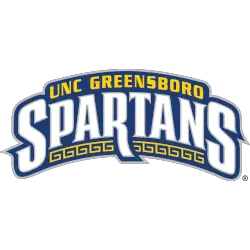
UNC Greensboro Spartans
2001 - 2020
A wordmark UNC GREENSBORO" in gold and a custom wordmark "SPARTANS" in white with silver trim all on a blue background with silver trim.
Font: Custom
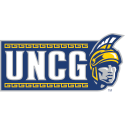
UNC Greensboro Spartans
2001 - 2020
Initials "UNCG" in white with silver trim next to a front view of a Spartan's head in grey, blue and white wearing a helmet in blue, gold and white all on a blue background.
Font: Custom


