Central Connecticut Blue Devils
The primary logo of the Central Connecticut Blue Devils’ wordmark beside the blue devil head is blue, gray, and white.
Blue Devils Wordmark Logo
The Central Connecticut Blue Devils are a powerhouse in the world of college sports, with a rich history and a dedicated fan base. But have you ever stopped to think about the history behind their iconic wordmark logo? In this blog post, we’ll take a trip down memory lane and explore the evolution of the Central Connecticut Blue Devils wordmark logo.
The Early Years (1929-1986)
The Central Connecticut Blue Devils were originally known as the Teachers College of Connecticut, with their athletic teams being referred to as the “Normalites”. In 1929, the school changed its name to Central Connecticut State College and adopted the nickname “Blue Devils”. However, it wasn’t until 1986 that the Blue Devils got their first official wordmark logo.
The first wordmark logo featured the school’s initials “CCSC” in a bold, block font. The letters were outlined in blue and white, with the word “Blue Devils” written in a smaller font underneath. This logo was simple and straightforward, but it lacked the visual impact that is now associated with the Blue Devils brand.
The Evolution (1987-2009)
In 1987, the Blue Devils underwent a rebranding and introduced a new wordmark logo. This logo featured a more stylized font, with the letters “CCSC” intertwined and the word “Blue Devils” written in a modern script font underneath. The logo also incorporated a blue devil’s head, giving it a more intimidating and powerful look.
This logo remained in use for over two decades, with minor tweaks being made along the way. In 2009, the Blue Devils made a significant change to their logo, replacing the intertwined letters with a more modern and sleek design. The new wordmark logo featured the letters “CCSU” in a bold, uppercase font, with the word “Blue Devils” written in a smaller font underneath. The blue devil’s head was also given a more realistic and detailed look.
The Present (2010-Present)
In 2010, the Blue Devils once again updated their wordmark logo, but this time, they went back to their roots. The current logo features the letters “CCSU” in a bold, block font, with the word “Blue Devils” written in a smaller font underneath. The logo also incorporates a blue devil’s head, similar to the one used in the 1987 logo.
This logo is a perfect combination of the simplicity of the original logo and the modernity

Central Connecticut Blue Devils
2011 - Present
A triple lined wordmark "CENTRAL" in white and "CONNECTICUT" in grey with a white and grey trident and "BLUE DEVILS" in grey all on a blue formed background.
Central Connecticut Blue Devils
2011 - Present
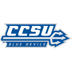
Initials "CCSU" in white with a white and grey trident and "BLUE DEVILS" in grey all on a blue formed background.

Central Connecticut Blue Devils
2011 - Present
A triple lined wordmark "CENTRAL" in white and "CONNECTICUT" in grey and "BLUE DEVILS" in grey all on a blue formed background.
Central Connecticut Blue Devils
2011 - Present
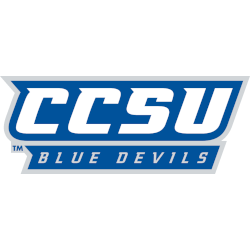
Initials "CCSU" in white above the wordmark "BLUE DEVILS" in grey on a blue with grey outline formed background.

Central Connecticut Blue Devils
2011 - Present
Initials "CCSU" in white on a blue with grey outline formed background.

Central Connecticut Blue Devils
2000 - 2011
A happy blue devil's head in blue, light blue, white and black above a wordmark "Blue Devils" in blue with white and black trim above a blue trident and the wordmark below "Central Connecticut State University" in black.

Central Connecticut Blue Devils
2000 - 2011
A wordmark "Blue Devils" in blue with white and black trim above a blue trident and the wordmark below "Central Connecticut State University" in black.
Central Connecticut Blue Devils
2000 - 2011
A wordmark "Blue Devils" in blue with white and black trim.


