Seattle Redhawks
A wordmark “SEATTLE” in red and the letter “U” in black.
Redhawks Wordmark Logo
The Seattle Redhawks are a prominent NCAA Division I basketball team that has existed since the 1940s. Throughout their history, they have had many memorable logos and wordmarks. In this blog post, we will explore the evolution of the Seattle Redhawks’ wordmark logo through its various iterations over time.
When first established in 1941, the original logo for the Seattle Redhawks featured a red hawk with an open beak perched atop a white shield bearing two crossed arrows in red and blue colors, respectively. This design was used until 1971, when it was replaced by another version featuring an image of a hawk with wings spread wide against an orange background outlined by black lines to represent feathers or fur on its body; this design also included “Seattle U” written across it in bold letters above and below which were two curved lines representing flight trails left behind as if from flying away quickly into action on game day!
By 1982, however, another new look emerged: A stylized letter S made up of overlapping triangles that created negative space between them to form what looks like mountains or waves coming offshore – very fitting for being located near Puget Sound! The accompanying text read “RedHawks,” all lowercase without any other words surrounding it but still managing to capture attention due to its unique shape-shifting nature; additionally, there were four stars at each corner, signifying excellence both academically & athletically within our student-athletes here at SUU (Seattle University).
Finally after more than three decades later came, 2013 when yet again another update took place where now, instead, just one triangle is seen making up part of the letter S while the remaining elements, such as stars, remain unchanged - the only difference being how much sharper/defined everything appears compared before thanks modern technology advancements available today allowing us to create something truly remarkable looking forward into future endeavors ahead too!
Overall throughout the last 80 years, we can see how much progress has been made regards designing iconic symbols synonymous not only with the university itself but also the city itself, which makes everyone proud to wear proudly show support wherever they go, whether the home court arena stands streets downtown area alike - no matter what happens next know one thing remains same: love passion shared fans world over towards beloved mascot still alive strong ever before hopefully many generations come to celebrate success together long way down the road too enjoys ride along the way!!
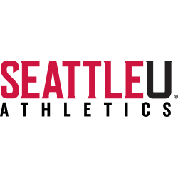
Seattle Redhawks
2008 - Present
A wordmark "SEATTLE" in red and the letter "U" in black above the wordmark "ATHLETICS" in black.
Font: Unknown


