Rutgers Scarlet Knights
A red letter “R” with black trim. A new shade of red.
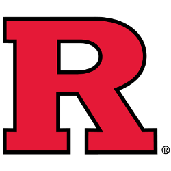
Rutgers Scarlet Knights
2001 - 2016
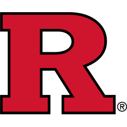
A red letter "R" with black trim.
Rutgers Scarlet Knights
1997 - 2001
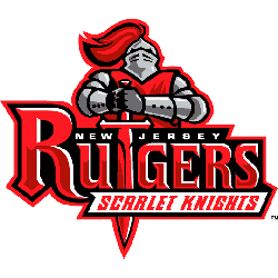
A red, grey and black knight holding sword downward to form the letter "T" in the wordmark "RUTGERS" and "SCARLET KNIGHTS" in red on a white banner.
Rutgers Scarlet Knights
1981 - 1997
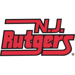
Initials "N.J." above wordmark "Rutgers" with 3 tails in red with black trim.
Rutgers Scarlet Knights
1972 - 1981
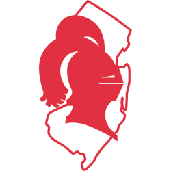
Right-facing knight head wearing a helmet on the state of New Jersey in red.
Rutgers Scarlet Knights
1967 - 1972
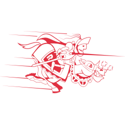
Armored knight carrying a joust pole riding a galloping armored horse in red.
Rutgers Scarlet Knights Logo History
The Rutgers Scarlet Knights Primary Logo has undergone changes to reflect modern design trends while maintaining its traditional elements. Each iteration showcases adjustments in color, typography, and detail to keep the logo relevant. For more information about the team, visit the Rutgers Scarlet Knights Wikipedia page, and see the Rutgers Scarlet Knights Alternate Logo page for additional logo versions.
Over the years, the Rutgers Scarlet Knights Primary Logo has preserved the team’s distinctive look, symbolizing strength and tradition. The high-quality Rutgers Scarlet Knights logo PNG files make it easy to study design refinements. Comparing primary and alternate logos gives fans a full perspective of the team’s branding evolution.
This page provides a thorough overview of the Rutgers Scarlet Knights logo history, displaying every Rutgers Scarlet Knights Primary Logo. Each Rutgers Scarlet Knights logo PNG ensures clarity, allowing fans to appreciate how the emblem has evolved while maintaining the team’s iconic identity.
College Sports Fan Products


Vote Now / All Scarlet Knights Fans!!
Click to go to Big 10 Logo Battle and vote


