Rice Owls
An Olde English letter “R” in blue. Former alternate logo. Different spacing on this logo.
Rice Owls
1996 - 2007
A blue and grey flying and attacking owl with white wordmark "RICE" and "OWLS" in blue and white on the chest.
Rice Owls
1986 - 1996
Split letter "R" in blue and gray with blue and grey outline.
Rice Owls
1979 - 1986
Mechanical design of a full-body flying owl in blue.

Rice Owls
1968 - 1979
Right-facing full-bodied owl in blue and white.
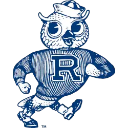
Rice Owls
1943 - 1968
A blue and white owl is walking and wearing a hat, shoes, and a sweater with the letter "R."
Rice Owls Logo History
Early designs in the Rice Owls logo history featured simple block lettering with limited detail. Over time, the Rice Owls Primary logo adopted cleaner lines and a more refined “R” mark that better represented the university. Many of these early versions are still shared in Rice Owls logo PNG format. More variations can be seen on our Rice Owls Alternate Logo page.
As the brand improved, the Rice Owls logo history introduced stronger shapes and a sharper serif style. The updated Rice Owls Primary logo became more recognizable across uniforms and media. The design’s clear lettering makes it ideal for digital use, especially in Rice Owls logo PNG graphics. Additional program details are available on the Rice University Wikipedia page.
The current look in the Rice Owls logo history highlights a bold and balanced emblem with polished lines. Today’s Rice Owls Primary logo remains consistent across all sports and reinforces a strong identity for the program. Many fans prefer the Rice Owls logo PNG for its high-resolution clarity. This modern version continues to represent the Owls with a clean and timeless style.
College Sports Fan Products