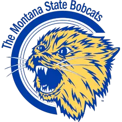
Bobcats Primary Logo
The Montana State Bobcats have a long and storied history, and their primary logo has played an important role in representing the team's spirit over the years. The original logo was designed in 1934 by a local artist named George M. Stovall, who wanted to create something that would capture the essence of Montana State University's athletic teams.
The first version of this iconic symbol featured two crossed tomahawks above a shield with MSU written across it. This design remained largely unchanged until 1978 when it underwent its first major update to include more vibrant colors as well as some minor changes to the design elements themselves. Since then, there have been several other updates including adding additional color variations for different sports teams within MSU athletics such as football and basketball programs in 1989; replacing “MSU” with “Bobcats” on all logos since 2004; updating most recently to add new font styles for various sports applications in 2017-2018 season.
Throughout these changes however, one thing has stayed consistent: The classic look of two crossed tomahawks above an oval shield remains at its core - making sure that no matter what else is added or changed about our beloved Bobcat mascot over time – we will always remember where we came from!
Bobcats Products
Auto Amazon Links: Could not resolve the given unit type, . Please be sure to update the auto-insert definition if you have deleted the unit.

Montana State Bobcats
A side view of a blue, gold, and white bobcat’s head.

Montana State Bobcats
A side view of a blue and gold bobcat’s head.

Montana State Bobcats
A side view of a gold bobcat’s head above a wordmark “Fighting” and “Bobcats” in blue.
A new shade of gold and blue.

Montana State Bobcats
A side view of a gold bobcat’s head above a wordmark “Fighting” and “Bobcats” in blue.

Montana State Bobcats
A yellow and blue bobcat’s head inside a blue circle with a wordmark encircling “The Montana State Bobcats” in blue.


