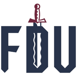
FairLeigh Dickinson Knights
A flame-bladed sword, a nod to the Hackensack River with the initials “FDU” in blue with white trim. The sword is split in half, each colored white and blue to represent the Township of Teaneck and the City of Hackensack. The handle of the sword features a castle-like design, an ode to Iviswold, the castle on FDU`s former campus in Rutherford, N.J., in burgundy and blue with white trim. The font that makes up the tall FDU letters uses straight characters and sharp edges, intended to represent both the iconic roof of the Rothman Center and battle armor.
Fairleigh Dickinson Knights
2019 - 2023
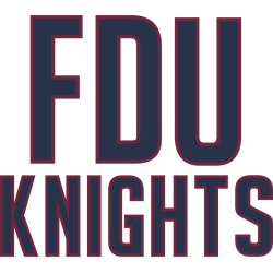
Initials "FDU" and a wordmark "KNIGHTS" in blue with burgundy trim.
Fairleigh Dickinson Knights
2004 - 2019
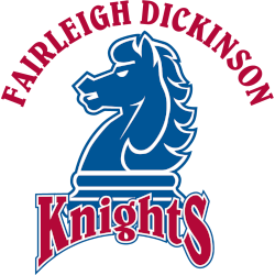
An arched wordmark "FAIRLEIGH DICKINSON" in burgundy above the horse chess piece in blue with white highlights and a bottom arched wordmark "KNIGHTS" in burgundy with white and blue trim.
Fairleigh Dickinson Knights
1995 - 2004
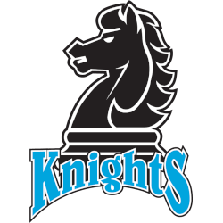
A horse chess piece in black with white highlights and a bottom arched wordmark "KNIGHTS" in blue with white and black trim.
Fairleigh Dickinson Knights Logo History
The Fairleigh Dickinson Knights logo history began with a primary logo focused on clarity and recognition. Early designs emphasized strong shapes and clear details. As a result, the Fairleigh Dickinson Knights primary logo worked well on uniforms and printed materials, helping establish a consistent team identity.
Over time, the Fairleigh Dickinson Knights primary logo received refinements to improve balance and visual impact. Additionally, designers updated elements to meet modern branding standards. Because of these changes, the logo remained recognizable across digital platforms. Many fans also search for Fairleigh Dickinson logo PNG files for design and editorial use.
This page features every official Fairleigh Dickinson Knights primary logo from start to present day. Each version represents a distinct stage in the Fairleigh Dickinson Knights logo history. For more background, visit Fairleigh Dickinson Knights Wikipedia. You can also visit the Fairleigh Dickinson Knights Alternate Logo Page to compare alternate designs with the primary logo.
College Sports Fan Products


Vote Now / All Knights Fans!!
As a proud Fairleigh Dickinson Knights fan, I urge you to recognize the courage and tradition behind this logo. The Knights emblem features a bold, noble knight that represents bravery, honor, and athletic pride. Among Northeast logos, it stands out for its strong symbolism and timeless identity.
Moreover, the name “Knights” reflects valor, discipline, and the drive to win with purpose. It captures resilience and competitive spirit. While other logos feel less distinguished, this one commands respect. For that reason, the Fairleigh Dickinson Knights logo deserves your support in this logo battle.