
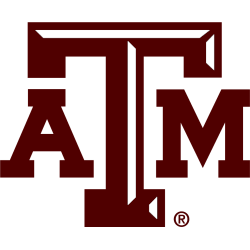
Texas A&M Aggies
The state of Texas is in maroon with white and maroon trim with initials “ATM.” The large letter “T” in the middle is in white with a maroon bevel and letters “AM” on either side in white. A darker shade of the color maroon. As the only SEC member in Texas at the time, the logo was created in 2012 to invoke a sense of state pride. In January 2021, the Lone Star logo became the primary logo.
Texas A&M Aggies
2016 - 2021
A maroon with silver trim letters "ATM" with white beveling on the letter "T."
A darker shade of the color maroon.
Texas A&M Aggies
2009 - 2016
A maroon with silver trim letters "ATM" with white beveling on the letter "T."
The "TAM" logo with bevels in Aggie Maroon. The shade of maroon was changed and gray outline was removed from the Primary version.

Texas A&M Aggies
2000 - 2009
A maroon with silver trim letters "ATM" with the letter "T" centered and larger.

Texas A&M Aggies
1981 - 2000
A maroon with white trim letters "ATM."

Texas A&M Aggies
1908 - 1927
Interlocking letters "AMC" in maroon. The letters "AMC" represent the Agricultural & Mechanical College of Texas.

Texas A&M Aggies
1876 - 1908
Intertwined stylized letters "AMC" above a wave wordmark "AGRICULTURAL & MECHANICAL COLLEGE OF TEXAS" and "Est 1876" in maroon.
Texas A&M Aggies Logo History
The Texas A&M Aggies primary logo has seen multiple design updates that reflect both tradition and modern aesthetics. By exploring the Texas A&M Aggies logo history, fans can trace changes in style, color schemes, and typography. Official Aggies logo PNG versions illustrate the team’s consistent branding across media and merchandise.
From vintage hand-drawn designs to digitally-rendered logos, each Texas A&M Aggies primary logo demonstrates the program’s commitment to identity and legacy. The Texas A&M Aggies logo history highlights key transitions, while Aggies logo PNG files show how the logos have been adapted for apparel, print, and online platforms. For more context, visit the Texas A&M Aggies History Page.
This comprehensive collection displays the Texas A&M Aggies primary logo along with all official Aggies logo PNG formats. For fans looking for alternative designs, see the Texas A&M Aggies Alternate Logo page. Together, these resources offer a complete guide to the team’s visual evolution from start to present.
College Sports Fan Products


Vote Now / All Aggies Fans!!
Step into the SEC Conference Team Logo Battle, where the Texas A&M Aggies’ logo stands as a powerful symbol of unity, loyalty, and unwavering spirit. Featuring the bold maroon and white ‘ATM,’ this emblem is more than a design—it embodies our university’s rich tradition, camaraderie, and pursuit of athletic excellence.
Among all SEC logos, none captures a team’s heart and soul with the same strength and distinction. The ‘ATM’ is a rallying cry that resonates deeply with every fan, commanding respect and admiration. Join us in celebrating the most emblematic logo in the SEC Conference and take pride in the enduring spirit of the Texas A&M Aggies!