Stony Brook Seawolves
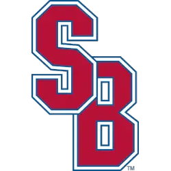
Initials “SB” overlapped in red with blue, white, and blue again trim.
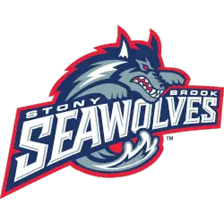
Stoney Brook Seawolves
1998 - 2008
A wave formed wolf's body in blue, grey and white with a red outline wrapped around a slanted wordmark "STONY BROOK" in white and "SEAWOLVES" in white with grey highlights on a blue with red trim.
Stony Brook Seawolves Logo History
Early in the Stony Brook Seawolves logo history, the primary logo focused on bold Seawolves imagery. The Stony Brook Seawolves Primary logo emphasized strength and motion. Because of this, the Stony Brook Seawolves logo PNG stood out on uniforms and athletic materials.
Over time, the Stony Brook Seawolves logo history introduced sharper lines and improved balance. These updates refreshed the Stony Brook Seawolves Primary logo for modern use. However, the Stony Brook Seawolves logo PNG always kept the fierce Seawolves character. Learn more on Wikipedia.
Today, this archive gathers the complete Stony Brook Seawolves logo history in one place. Every Stony Brook Seawolves Primary logo appears from start to today. Fans comparing each Stony Brook Seawolves logo PNG can also visit Stony Brook Seawolves Alternate Logo Page to view official alternate designs.
College Sports Fan Products


Vote Now / All Seawolves Fans!!
As a proud Stony Brook Seawolves fan, I urge you to recognize the originality and strength behind this logo. The Seawolves emblem features a fierce mythical seawolf that represents innovation, confidence, and athletic pride. Among Coastal Athletic League logos, it stands out for its bold and imaginative identity.
Moreover, the name “Seawolves” reflects courage, uniqueness, and competitive drive. It captures determination and the will to win. While other logos feel less creative, this one commands attention. For that reason, the Stony Brook Seawolves logo deserves your support in this logo battle.
Click to go to Coastal Athletic Logo Battle and vote


