Santa Clara Broncos
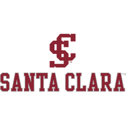
The Broncos officially unveiled a style change and logo enhancement on January 28, 2016. The interlocking letters “S” and “C” are a refreshed look to the classic style of the logo. The “S” and “C” are above the wordmark “SANTA CLARA” in red.

Santa Clara Broncos
2004 - 2016
A side view of silver with black trim bronco’s head with wordmark “SANTA CLARA” in red with white and black trim and “BRONCOS” in white with black trim on a red with black highlight banner.
Santa Clara Broncos
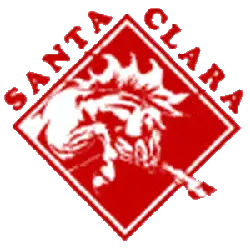
1988 - 2004
A white bronco inside a red diamond with a white trim and a wordmark "STANTA CLARA" in red.
Santa Clara Broncos Primary Logo
The Santa Clara Broncos primary logo has undergone several updates in color, design, and typography to reflect a contemporary and professional look. The Santa Clara Broncos logo history showcases these transformations, while high-quality Santa Clara Broncos logo PNG files ensure consistency for digital media, merchandise, and promotional materials.
Through its evolution, the Santa Clara Broncos primary logo has maintained a balance between heritage and modern branding. The Santa Clara Broncos logo history emphasizes key redesigns that preserve the team’s legacy while appealing to fans, students, and alumni.
The Santa Clara Broncos primary logo remains the centerpiece of all official branding. Alternate logos are used for special events or merchandise, but the primary emblem continues to be the most recognized. Explore the full Santa Clara Broncos history
and visit the Santa Clara Broncos alternate logo page for additional versions.


