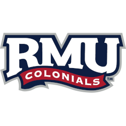
Robert Morris Colonials
The initials “RMU” are in white on a blue-formed background, the wordmark “COLONIALS” is in white on a red waving banner with a blue trim, and the whole logo has a silver trim.
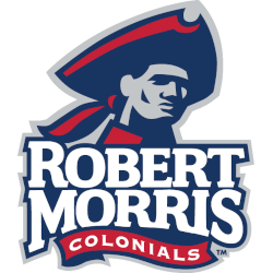
Robert Morris Colonials
2006 - 2020
A colonial's head wearing a tricorne hat above stacked wordmark "ROBERT MORRIS' in white with blue trim and "COLONIALS" in white on a red with blue trim banner background.
Rickabaugh Graphics create the logo.
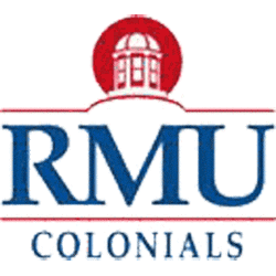
Robert Morris Colonials
2002 - 2006
Initials "RMU" in blue with white trim between red lines with wordmark "COLONIALS" at the bottom in blue and an institutional white building inside a red circle at the top.

Robert Morris Colonials
1985 - 2002
Streaking letters in the initials "RMC" in blue between red lines and wordmark "COLONIALS" at the bottom and 7 blue stars in ring formation.
Robert Morris Colonials Logo History
The Robert Morris Colonials Primary logo forms the foundation of the team’s visual identity. Throughout the Robert Morris Colonials logo history, designers refined shapes, colors, and proportions. As a result, the primary mark remained clear and effective across uniforms and branding. Additional background is available on Colonials Wikipedia for Robert Morris Colonials.
As branding standards evolved, the Robert Morris Colonials Primary logo adopted cleaner lines and better balance. Therefore, newer designs improved clarity across digital and print platforms. Each version still connects visually to earlier Robert Morris logos, allowing fans to follow the full Robert Morris Colonials logo history with ease.
While this page focuses on primary designs, alternate marks also support the overall brand. For that reason, visit Robert Morris Colonials Alternate Logo Page to review secondary styles. Together, alternate designs and the Robert Morris Colonials Primary logo present a complete visual timeline of the Robert Morris Colonials logo history from start to present.
College Sports Fan Products


Vote Now / All Colonials Fans!!
As a proud Robert Morris Colonials fan, I urge you to recognize the history and determination behind this logo. The Colonials emblem features a strong colonial soldier that represents strategy, resilience, and athletic pride. Among Horizon League logos, it stands out for its heritage and meaningful identity.
Moreover, the name “Colonials” reflects discipline, courage, and the drive to win. It captures focus and competitive purpose. While other logos feel less inspiring, this one commands respect. For that reason, the Robert Morris Colonials logo deserves your support in this logo battle.
Click to go to Horizon League Logo Battle and vote


