Mercyhurst Lakers
A wordmark “MERCYHURST” above the smaller wordmark “UNIVERSITY” in white across a navy bar atop a block letter “M” with serifs with white and navy trim.

Mercyhurst Lakers
2012 - 2018
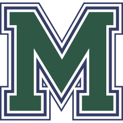
A block letter "M" with serifs in green with a white and navy trim.
Mercyhurst Lakers
2000 - 2012
A block letter "M" with serifs in green with double white and a navy trim.
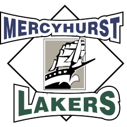
Mercyhurst Lakers
1994 - 2000
An old ship in black and white inside a gray box overlapping a white diamond between a bowtie arched wordmark "MERCYHURST" in blue on top and "LAKERS" in green on the bottom.

Mercyhurst Lakers
1973 - 1994
Geometric font and lettering "MC" in green and blue
Representing Mercyhurst College.
Mercyhurst Lakers Logo History
The Mercyhurst Lakers logo history began with a primary logo focused on clear identity and recognition. Early designs used strong shapes and balanced elements. As a result, the Mercyhurst Lakers primary logo appeared effective on uniforms and printed materials while establishing a consistent team image.
Over time, the Mercyhurst Lakers primary logo received refinements to improve detail and consistency. Additionally, designers adjusted elements to meet modern branding standards. Because of these updates, the logo remained recognizable across digital platforms. Many fans also search for Mercyhurst Lakers logo PNG files for design use.
This page features every official Mercyhurst Lakers primary logo from start to present day. Each version represents a key stage in the Mercyhurst Lakers logo history. For more background, visit Mercyhurst Lakers Wikipedia. You can also visit the Mercyhurst Lakers Alternate Logo Page to compare alternate designs with the primary logo.
College Sports Fan Products

Vote Now / All Lakers Fans!!
As a Mercyhurst Lakers fan, you can take pride in the calm strength reflected in the team’s logo. Inspired by the lake, the Mercyhurst Lakers emblem represents balance, focus, and steady determination. It reflects the athletic identity Mercyhurst University has built through discipline, consistency, and competitive excellence.
Among Northeast teams, few logos communicate composure and confidence as clearly as the Lakers. The name stands for resilience and control rather than excess. While other logos rely on aggression, the Mercyhurst Lakers logo earns respect through meaning, tradition, and a deep connection with its fans.


