Lipscomb Bisons
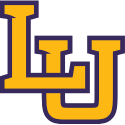
Lipscomb University drops the LU logo after being pressured by Liberty University to stop using the monogram, and changed their primary mark to a stand-alone yellow with purple trim letter “L.”
Lipscomb Bisons
2012 - 2014
Initials "LU" in yellow with purple trim.
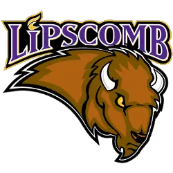
Lipscomb Bisons
1999 - 2012
A wordmark "LIPSCOMB" in purple with white trim on a black formed background with yellow highlights above a brown, black, white and yellow bison.

Lipscomb Bisons
1988 - 1999
An arched wordmark LIPSCOMB" above four bisons running to our left above reverse arched wordmark "UNIVERSITY" all in purple.
Lipscomb Bisons Logo History
The Lipscomb Bisons primary logo centers on a strong bison head with bold outlines and sharp details, symbolizing power and resilience. Early logos focused on traditional text and mascot imagery, while modern updates streamlined the design for clarity and digital use. These primary logos appear across uniforms, merchandise, and promotional materials. Learn more about the program on the team’s Wikipedia page: Lipscomb Bisons.
The Lipscomb Bisons logo history shows gradual improvements in color, shape, and typography. Each iteration ensured the mascot remained prominent while enhancing overall readability and visual appeal. Fans can also check the Lipscomb Bisons Alternate Logo page to see secondary designs that complement the primary logo.
All Lipscomb logo PNG files included here illustrate the full evolution of the team’s primary mark. From early detailed designs to modern streamlined graphics, the logos reflect Lipscomb University’s commitment to maintaining a strong and recognizable athletic identity.
College Sports Fan Products