Le Moyne Dolphins
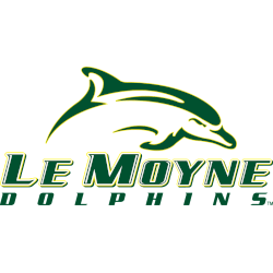
A jumping dolphin in green with gold trim above the wordmark “LE MOYNE” in green with white highlights and gold trim, “DOLPHINS” in green.
Le Moyne Dolphins
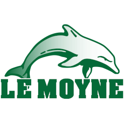
1999 - 2008
A dolphin jumping in gradient green and white above the wordmark "LE MOYNE" in green with white trim.
Le Moyne Dolphins Logo History
The Le Moyne Dolphins logo history began with a primary logo that emphasized clarity and identity. Early designs featured a recognizable dolphin symbol with balanced shapes. As a result, the Le Moyne Dolphins primary logo worked well on uniforms and printed materials while establishing a strong visual presence.
Design Refinement and NCAA Identity
Over time, the Le Moyne Dolphins primary logo received refinements to improve detail and consistency. Additionally, designers adjusted elements to align with NCAA branding standards. Because of these updates, the logo fits naturally among other dolphin logo NCAA designs while remaining unique to the program.
This page includes every official Le Moyne Dolphins primary logo from start to present day. Each version reflects a specific phase in the Le Moyne Dolphins logo history. For more background, visit Le Moyne Dolphins Wikipedia. You can also visit the Le Moyne Dolphins Alternate Logo Page to compare alternate designs with the primary logo.
College Sports Fan Products


Vote Now / All Dolphins Fans!!
As a proud Le Moyne Dolphins fan, I urge you to recognize the intelligence and elegance behind this logo. The Dolphins emblem features a graceful dolphin that represents focus, agility, and athletic pride. Among Northeast logos, it stands out for its clean design and thoughtful identity.
Moreover, the name “Dolphins” reflects intelligence, balance, and competitive drive. It captures determination and the pursuit of victory with precision. While other logos feel less refined, this one commands respect. For that reason, the Le Moyne Dolphins logo deserves your support in this logo battle.
Click to go to Northeast Logo Battle and vote


