
Iowa Hawkeyes
Black side view of a hawk’s head.
Iowa Hawkeyes
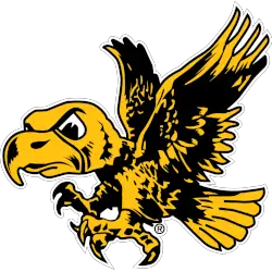
1956 - 1979
Flying mascot Herky in gold and black with white eyes.
Iowa Hawkeyes Logo History
Early versions of the Iowa Hawkeyes Primary Logo focused on simple yet bold elements to convey the team’s spirit. Over time, the designs evolved, incorporating sharper lines and a more defined hawk motif. For additional context on the team’s history, check out the Iowa Hawkeyes Wikipedia page.
Throughout the Iowa Hawkeyes logo history, several vintage Iowa Hawkeyes logo variations were used in print and merchandise, highlighting the team’s evolving identity. You can also view these designs alongside our collection on the Iowa Hawkeyes alternate logo page.
Modern iterations of the Iowa Hawkeyes Primary Logo maintain the iconic look while adapting to digital and high-resolution formats. Fans can explore each update and see high-quality vintage Iowa Hawkeyes logo images to appreciate the full scope of the Iowa Hawkeyes logo history.
College Sports Fan Products
Auto Amazon Links: No products found.
Vote Now / All Hawkeyes Fans!!
Click to go to Big 10 Logo Battle and vote


