
Fairfield Stags
A side view of a deer’s head in red, white, silver, and black is above the wordmark “FAIRFIELD” in red with black trim and “UNIVERSITY” in black.
Fairfield Stags
1991 - 2002
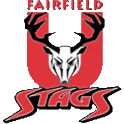
A front facing deer's head in black and white on a letter "U" in red with a wordmark "FAIRFIELD" in red above and below a custom wordmark "STAGS" in red with white trim on a black formed background.
Fairfield Stags Logo History
The Fairfield Stags Primary logo stands at the center of the program’s visual identity. Throughout the Fairfield Stags logo history, designers refined shapes, line weight, and balance. As a result, the Fairfield Stags logo PNG remained clear across uniforms, venues, and digital media. More background appears on Stags Wikipedia.
As branding standards changed, the Fairfield Stags Primary logo focused on subtle refinement. Therefore, updates improved clarity without altering core elements. These changes strengthened the Fairfield Stags logo history while preserving familiarity tied to the long-standing Fairfield Stags logo PNG.
While this page highlights primary branding, alternate marks also support the identity. For that reason, visit the Fairfield Stags Alternate Logo Page to review secondary styles. Together, alternates and the Fairfield Stags Primary logo complete the visual record of the Fairfield Stags logo history from start to present.
College Sports Fan Products


Vote Now / All Stags Fans!!
As a proud Fairfield Stags fan, I urge you to recognize the elegance and strength behind this logo. The Stags emblem features a majestic stag that represents grace, resilience, and athletic pride. Among MAAC logos, it stands out for its refined look and meaningful symbolism.
Moreover, the name “Stags” reflects poise, toughness, and competitive drive. It captures determination and the pursuit of victory. While other logos feel less inspiring, this one commands respect. For that reason, the Fairfield Stags logo deserves your support in this logo battle.