Detroit Mercy Titans
A wordmark “DETROIT” in white and “TITANS” in red with white trim on a blue formed background in a stylized font with a bolt at the end of the letter “S” in front of a tilted sword and a dented shield in blue, red, and grey. The shades of red and grey were changed.
Detroit Mercy Titans
2015 - 2016
A wordmark "DETROIT" in white and "TITANS" in red with white trim on a blue formed background in a stylized font with a bolt at the end of the letter "S" in front of a tilted sword and a dented shield in blue, red, and grey.
New shade of blue and red.
Detroit Mercy Titans
2008 - 2015
A wordmark "DETROIT" in white and "TITANS" in red with white trim on a blue formed background in a stylized font with a bolt at the end of the letter "S" in front of a tilted sword and a dented shield in blue, red, and grey.
Detroit Mercy Titans
1993 - 2008
A silhouette of a titan's head in red above the initials "UDM" in blue and above the wordmark "TITANS" in white inside a blue, white, red bar.
Detroit Mercy Titans
1989 - 1993
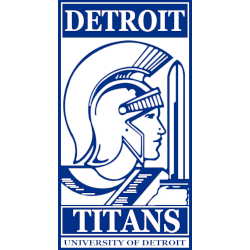
A rectangle design with wordmark "DETROIT" at the top and "TITANS" at the bottom within a blue bar and a side profile of a titan wearing a helmet, uniform, and sword, also a wordmark "UNIVERSITY OF DETROIT" all in blue and white.

Detroit Mercy Titans
1965 - 1989
Red with white trim oval and stacked wordmark "University of Detroit" in white next to a Olde English lowercase D in white.
Detroit Mercy Titans Logo History
The Detroit Mercy Titans Primary logo anchors the team’s visual identity within the broader Detroit Mercy Titans logo history. Over time, designers refined symbols, colors, and proportions. However, the primary mark consistently reinforced recognition across uniforms and media. For institutional background, visit the Wikipedia page of Detroit Mercy Titans.
As branding standards progressed, the Detroit Mercy Titans Primary logo adopted cleaner lines and stronger balance. Therefore, modern versions appear more versatile across digital and print platforms. Each update still connects visually to earlier Detroit Mercy logos, clearly documenting the Detroit Mercy Titans logo history from start to present.
Although this page focuses on primary marks, alternate designs also support the overall brand. For that reason, visit Detroit Mercy Titans Alternate Logo Page to review secondary styles. Together, alternate marks and the Detroit Mercy Titans Primary logo complete the visual record shown throughout the Detroit Mercy Titans logo history.
College Sports Fan Products


Vote Now / All Titans Fans!!
As a proud Detroit Mercy Titans fan, I urge you to recognize the power and tradition behind this logo. The Titans emblem features a strong Titan that represents resilience, confidence, and athletic pride. Among Horizon League logos, it stands out for its commanding presence and bold identity.
Moreover, the name “Titans” reflects strength, endurance, and the drive to win. It captures dominance and competitive spirit. While other logos feel less imposing, this one demands respect. For that reason, the Detroit Mercy Titans logo deserves your support in this logo battle.
Click to go to Horizon League Logo Battle and vote


