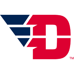
Dayton Flyers
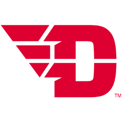
The letter “D” in red with a red wing coming off the letter.
Dayton Flyers
2013 - 2015
A darker blue snow capped mountain peak over “Nuggets” wordmark in yellow with a light blue trim. This logo has evolved for the 2009 season with the reintroduction of navy blue to the previous color scheme.
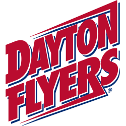
Dayton Flyers
1995 - 2013
Diagonal wordmark "Dayton FLYERS" in red with blue highlights and an over and under score.
Dayton Flyers Logo History
Early versions of the Dayton Flyers Primary logo used block-style lettering with minimal styling, reflecting the school’s traditional athletics era. As the brand developed, the team introduced sleeker designs featuring a dynamic “D” paired with angled wings, which became a key part of the Dayton Flyers logo history. These updates gave the program a faster and more distinctive appearance. Full program details are available on the Dayton Flyers Wikipedia page.
The introduction of the Dayton Flyers new logo marked a major shift toward a more modern identity. This version uses clean geometric edges and bold red tones, improving visibility on uniforms, digital graphics, and merchandise. The sharp wing element became a defining part of the Dayton Flyers Primary logo, helping the brand stand out in conference play. Fans can compare these primary marks on our Dayton Flyers Alternate logo page.
Across the full Dayton Flyers logo history, each redesign has pushed the brand toward clarity, speed, and stronger visual impact. The modern Dayton Flyers new logo continues this trend by using improved spacing and a more confident shape. With its sharp lines and recognizable layout, the Dayton Flyers Primary logo remains one of the most distinctive marks in college athletics.
College Sports Fan Products
