
Auburn Tigers
Interlocked letters “AU” in blue with orange trim.
Auburn Tigers
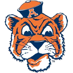
1957 - 1966
Head shot of a tiger with blue and orange sailor's hat and the letter "A" in orange with white trim.
Auburn Tigers Logo History
The Auburn Tigers primary logo is one of the most recognizable marks in college athletics. Across the Auburn Tigers logo history, the interlocking “AU” has remained the defining element, symbolizing unity and strength. Early versions focused on simplicity, while later designs refined proportions for consistency across uniforms and merchandise.
As branding standards changed, updates to the Auburn Tigers primary logo emphasized balance, legibility, and adaptability. These refinements ensured the logo performed well in print, broadcast, and digital formats. Each update in the Auburn Tigers logo history reflects Auburn’s commitment to tradition while embracing modern design needs. Detailed historical context is available on the official team history page.
This archive presents every Auburn Tigers primary logo from the program’s beginning to the present day, including clean Auburn Tigers logo PNG files for reference. To explore design variations and secondary marks, visit the Auburn Tigers Alternate Logo page for a complete visual timeline.
College Sports Fan Products


Vote Now / All Tigers Fans!!
Gear up for the thrilling SEC Conference Team Logo Battle, where the Auburn Tigers logo steps forward to challenge the best in the conference. Featuring the fierce Tiger, this emblem is more than a visual identity—it represents Auburn’s storied history, competitive fire, and unbreakable resolve.
Rooted in tradition and pride, the Auburn Tigers logo symbolizes resilience, loyalty, and relentless determination. For fans, it is a powerful badge of honor that roars with confidence, proving the Tigers’ emblem doesn’t just stand out—it commands respect across the SEC.
Click to go to SEC Logo Battle and vote


