Manhattan Jaspers
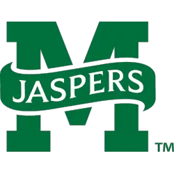
A block letter “M” in green with a wordmark “JASPERS” in white on a green banner.
Manhattan Jaspers
1981 - 2012
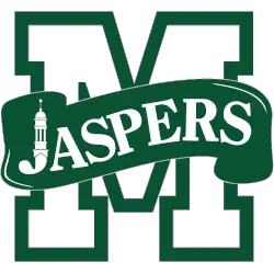
A letter "M" in white with a green thick trim and a wordmark "JASPERS" in white on a green banner. the letter "J" is a custom bell tower from campus.
Manhattan Jaspers Logo History
The Manhattan Jaspers Primary logo has always been the foundation of the program’s visual identity. Throughout the Manhattan Jaspers logo history, designers adjusted shape, balance, and clarity. As a result, the Manhattan Jaspers logo PNG remained easy to recognize across uniforms, courts, and official materials. Additional details are available on Jaspers Wikipedia for Manhattan Jaspers.
Instead of major redesigns, the Manhattan Jaspers Primary logo evolved through refinement. Therefore, updates focused on cleaner lines and better legibility. These changes helped modernize the look while preserving continuity within the broader Manhattan Jaspers logo history seen in each Manhattan Jaspers logo PNG.
Although this page centers on primary branding, alternate designs also play a role. For that reason, visit the Manhattan Jaspers Alternate Logo Page to see supporting marks used over time. Together, alternate designs and the Manhattan Jaspers Primary logo present a complete visual record of the Manhattan Jaspers logo history from start to present.
College Sports Fan Products


Vote Now / All Jaspers Fans!!
As a proud Manhattan Jaspers fan, I urge you to recognize the tradition and determination behind this logo. The Jaspers emblem, defined by its bold green and white identity, represents integrity, focus, and athletic pride. Among MAAC logos, it stands out for its meaning and strong character.
Moreover, the name “Jaspers” reflects perseverance, loyalty, and the drive to win. It captures resilience and competitive spirit. While other logos feel less compelling, this one commands respect. For that reason, the Manhattan Jaspers logo deserves your support in this logo battle.
Click to go to MAAC Logo Battle and vote


