Incarnate Word Cardinals
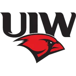
A side view of a cardinal’s head is in red and black below the initials “UIW” in black.
Incarnate Word Cardinals
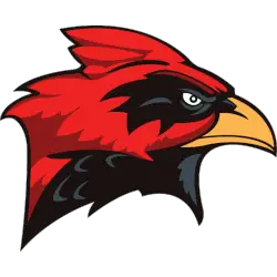
2004 - 2011
Very details cardinal in red, black, and orange.
Incarnate Word Cardinals Logo History
The Incarnate Word Cardinals logo was created to reflect strength and tradition. Early primary logos focused on clear lettering and strong color contrast. These choices helped the Incarnate Word Cardinals logo stand out across sports, including Incarnate Word Cardinals baseball uniforms and merchandise.
As branding standards improved, the Incarnate Word Cardinals logo became more refined. Line work sharpened, and proportions were adjusted for balance. These updates improved readability in print and digital formats, especially when shared as an Incarnate Word logo PNG across media platforms.
The current Incarnate Word Cardinals primary logo delivers consistency and recognition. It remains central to Incarnate Word Cardinals baseball and other programs. For deeper context, visit the Incarnate Word Cardinals History page. You can also explore design variations on the Incarnate Word Cardinals Alternate Logo page.
College Sports Fan Products


Vote Now / All Cardinals Fans!!
As an Incarnate Word Cardinals fan, it is easy to appreciate the elegance and vitality reflected in the Cardinals logo. Featuring a vibrant cardinal, the emblem represents energy, grace, and athletic excellence—qualities that define Incarnate Word’s competitive identity. Among Southland Conference logos, the Cardinals logo stands out for how clearly it communicates confidence, passion, and team pride.
The name “Cardinals” symbolizes graceful elegance, radiant vitality, and a relentless drive to succeed. This meaning gives the logo lasting impact, making it a unifying symbol for fans and athletes alike. Compared to other team logos, few inspire the same level of respect and admiration. In any logo battle, the Incarnate Word Cardinals logo remains a striking emblem of elegance and vitality.
Click to go to Southland Logo Battle and vote


