
Houston Christian Huskies
The initials “HCU” are in blue with orange highlights above a front-facing huskie head in blue, white, and orange with an orange outline. The first logo with the new name that was changed from “Houston Baptist.”
Houston Baptist Huskies
2011 - 2023
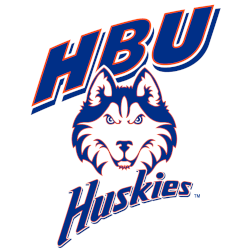
A front-facing huskie head in blue, white, and orange centered with the slanted diagonal stylized initials "HBU" above and a slanted diagonal stylized wordmark "Huskies" scripted below in blue with orange highlights.

Houston Baptist Huskies
2002 - 2011
A Husky's head in blue, white and orange above slanted diagonal stylized "HBU" centered within the wordmark "Huskies" in white, blue, and orange.

Houston Baptist Huskies
1991 - 2002
A left-facing panting husky's head in blue and white.

Houston Baptist Huskies
1985 - 1991
A roundel featuring the wordmark "HOUSTON BAPTIST UNIVERSITY HUSKIES" in a sans-serif font in white in the outer orange ring and initials stylized "HBU" in blue between a blue split center circle.
Houston Christian Huskies Logo History
The Houston Christian Huskies logo first focused on clarity and school recognition. Early primary logos relied on clean lettering and simple symbols. These elements helped the Houston Christian football logo stand out on uniforms and promotional material. Many early Huskies logo PNG versions were created for print use.
As the program expanded, the Houston Christian Huskies logo gained stronger structure and sharper detail. Color balance and typography were refined to improve visibility. This stage of the Houston Christian Huskies logo history reflects a shift toward modern athletic branding while staying true to tradition.
The current Houston Christian Huskies primary logo delivers consistency across sports. It is widely shared as a Huskies logo PNG for digital platforms. To learn more, visit the Houston Christian Huskies History page. You can also explore variations on the Houston Christian Huskies Alternate Logo page.
College Sports Fan Products


Vote Now / All Huskies Fans!!
As a Houston Christian Huskies fan, it is easy to admire the strength and endurance reflected in the Huskies logo. Featuring a majestic husky, the emblem represents resilience, power, and athletic excellence—qualities that define Houston Christian’s competitive spirit. Among Southland Conference logos, the Huskies logo stands out for how clearly it communicates toughness, confidence, and team pride.
The name “Huskies” symbolizes unyielding strength, steadfast endurance, and a relentless drive to succeed. This meaning gives the logo lasting significance, making it a unifying symbol for fans and athletes alike. Compared to other team logos, few inspire the same level of respect and admiration. In any logo battle, the Houston Christian Huskies logo remains a powerful emblem of strength and endurance.
Click to go to Southland Logo Battle and vote


