Virginia Tech Hokies
Two letters joined together “VT” in Chicago maroon with a white and burnt orange trim.
Hokies Primary Logo
The Virginia Tech Hokies have a long and proud history of athletic excellence, and their primary logo has been integral to that legacy. The first iteration of the logo was created in 1964 by then-athletic director Frank O. Moseley as a modern update to the school's original seal, which had been used since 1896. This new version featured an orange oval with white lettering spelling out "Virginia Polytechnic Institute," along with two crossed sabers set against a black background.
In 1982, the design was tweaked slightly to include a more prominent use of maroon and gray colors on either side of the oval; this color scheme would become synonymous with Virginia Tech athletics for decades to come. In 2003, another change was made when VT added its iconic “VT” monogram at a center stage within the oval shape; this allowed fans everywhere to instantly recognize their beloved team even without seeing any other elements associated with it, such as wordmarks or mascots!
Today’s version remains unchanged from its debut over 50 years ago. Still, it continues to be one of college sports' most recognizable logos - representing success on the field and pride in being part of Hokie Nation! It is no wonder so many people proudly display it both near campus grounds or far away from Blacksburg – because they know what lies beneath strength through unity & determination towards victory!

Virginia Tech Hokies
1974 - 1983
Double lined letters with a orange letter "T" on top and a crimson letter "V" on the bottom.

Virginia Tech Hokies
1971 - 1974
Double lined letters with a orange letter "T" on top and a crimson letter "V" on the bottom.
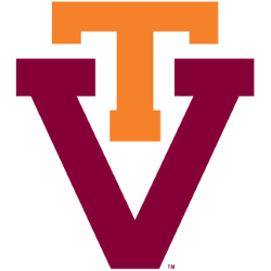
Virginia Tech Hokies
1966 - 1971
Double lined letters with a orange letter "T" on top and a crimson letter "V" on the bottom.
College Sports Fan Products
