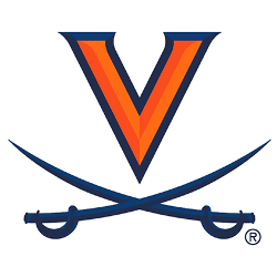
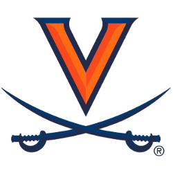
Virginia Cavaliers
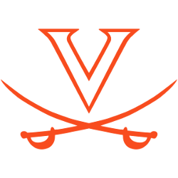
The Virginia logo features a large orange with highlights letter “V” with a blue outline and two blue sabers crisscrossed underneath.
“After the release of our new logos on April 24, I was made aware of the negative connotation between the serpentine walls and slavery,” Williams said in a news release. “I was not previously aware of the historical perspective indicating the original 8-foot-high walls were constructed to mask the institution of slavery and enslaved laborers from public view.
Cavaliers Primary Logo
The Virginia Cavaliers have had a long and storied history since their inception in 1819. Their primary logo has undergone many changes over the years, but its core design remains unchanged. The original logo featured a simple "V" with two crossed swords beneath it, representing the school's military roots and commitment to honor and integrity. Over time, other elements were added to make it more visually appealing; for example, an orange circle was added around the "V" in 1970 to signify unity among students at UVA.
In 1984, UVA adopted what is now considered its most iconic logo: a white saber between two stacked orange V’s on top of each other with “Virginia” written across them in bold font below it all. This design quickly became synonymous with college sports fans everywhere as one of the most recognizable logos associated with collegiate athletics today! It also inspired future university-branded products such as hats or t-shirts that feature this distinctive symbol prominently displayed on them - further cementing its place within popular culture worldwide!
Today's version of the Virginia Cavaliers' primary logo retains much of what made up earlier designs while incorporating some modern touches like adding blue accents around certain parts (such as outlining both V’s). Overall, no matter how much things may change over time, there will always be something special about that classic ‘84 look – ensuring everyone knows exactly who they're rooting for when they see those familiar colors proudly displayed wherever they go!

Virginia Cavaliers
2020
A darker blue snow capped mountain peak over “Nuggets” wordmark in yellow with a light blue trim. This logo has evolved for the 2009 season with the reintroduction of navy blue to the previous color scheme.
Virginia Cavaliers
1994 - 2019
A darker blue snow capped mountain peak over “Nuggets” wordmark in yellow with a light blue trim. This logo has evolved for the 2009 season with the reintroduction of navy blue to the previous color scheme.
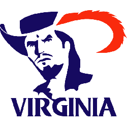
Virginia Cavaliers
1998 - 1994
A blue with red feather Cavalier's head over a wordmark "VIRGINIA" in blue.
College Sports Fan Products