Murray State Racers
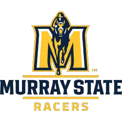
A blue, yellow, and white jockey and horse silhouette on a yellow and white with the blue and yellow trim letter “M” above a wordmark “MURRAY STATE” in blue between two yellow lines and “RACERS in yellow.
Designed by Joe Bosack.
Racers Primary Logo
The Murray State Racers have a long and storied history in the NCAA, but their primary logo has remained relatively unchanged since its inception. The iconic “Racers” script is one of the most recognizable logos in college sports, and it has been part of the team’s identity for nearly 80 years.
The original design was created by local artist Bill Martin back in 1941 when he was commissioned to create a new logo for what would become known as Murray State University. Martin chose to feature an interlocking “MSU” with two racing horses on either side – representing both speed and strength – which became instantly popular with fans across campus. This classic design remains largely unchanged today, although some minor tweaks were made over time such as switching from blue-and-white colors to black-and-gold ones that better represented school spirit (the current version features gold lettering).
Throughout its tenure at MSU, this iconic symbol has become synonymous with success; there have been numerous conference championships won under this banner since it first appeared on uniforms decades ago! It also serves as an important reminder that no matter how much time passes or how many changes occur within collegiate athletics programs nationwide—Murray State will always be home to one of America's most beloved teams: The Racers!
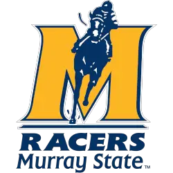
Murray State Racers
1998 - 2014
A blue and white jockey and horse silhouette on a yellow with blue trim letter "M" above a wordmark "RACERS Murray State" in blue.
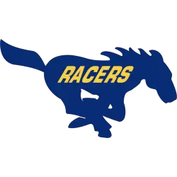
Murray State Racers
1995 - 1998
A racing horse in blue with a wordmark "RACERS" in gold across the side of the horse.
College Sports Fan Products
