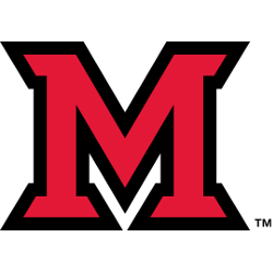
Miami (Ohio) Redhawks
The letter “M” is in red with thick black trim.
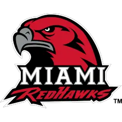
Miami (Ohio) Redhawks
2010 - 2012
A red, black, and white Redhawk's head with a killer look on top of the wordmark "MIAMI" in white and "REDHAWKS" in red on a black background.
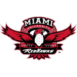
Miami (Ohio) Redhawks
1997 - 2010
Arched and beveled wordmark "MIAMI" in white above "UNIVERSITY" above full-bodied and wing span Redhawk with silver beak clutching a ribbon with stylized wordmark "REDHAWKS" with a brick arch in the background in red, silver, black, and white.
Miami RedHawks Logo History
The Miami RedHawks logo history shows a strong emphasis on tradition and clarity. Early primary logos relied on bold shapes and straightforward symbolism. However, later Miami RedHawks Primary logo updates refined these elements. As a result, each Miami RedHawks logo PNG remains distinctive while adapting to modern design standards.
Over time, the Miami RedHawks Primary logo kept a recognizable structure. While outlines and details evolved, the overall look stayed familiar. Moreover, this Miami RedHawks logo history highlights steady progression rather than dramatic redesigns. Each Miami RedHawks logo PNG reflects its era without losing visual continuity.
This page presents every official primary logo used by Miami RedHawks from the program’s beginning to the present day. Therefore, it serves as a complete visual archive. For team background, visit Miami RedHawks Wikipedia. To explore secondary designs, visit Miami RedHawks Alternate Logo Page.
College Sports Fan Products


Vote Now / All Redhawks Fans!!
As a proud Miami (Ohio) RedHawks fan, I urge you to recognize the focus and intensity behind this logo. The RedHawks emblem features a sharp, determined red hawk that represents precision, confidence, and athletic pride. Among MAC logos, it stands out for its bold design and competitive presence.
Moreover, the name “RedHawks” reflects speed, accuracy, and the drive to win. It captures fearless energy and relentless effort. While other logos feel less striking, this one commands respect. For that reason, the Miami (Ohio) RedHawks logo deserves your support in this logo battle.