
Florida Atlantic Owls
A front view of an owl in blue, white, and red. Former alternate logo.
Owls Primary Logo
Throughout the years, Florida Atlantic Owls has proudly represented their school with a variety of logos. From its inception in 2001 to today, the Primary Logo has been an integral part of FAU's identity and history. This blog post will take a look back at how this iconic logo evolved over time and what it means for the university today.
The original logo was created in 2001 by graphic design firm SME Branding Solutions Inc., which is now known as SME Design Group LLC. It featured an owl perched on top of “FAU” lettering inside a blue shield shape with white trim along its edges to give it more definition and depth. The colors used were navy blue, gold, white and black—the same colors that are still used today for all official FAU branding materials including sports uniforms apparel items such as hats or t-shirts.
In 2009, there was another update made to the logo when new athletic director Pat Chun decided he wanted something fresh but still recognizable from previous designs. He chose two variations: one featuring just an owl head inside a circle shape filled with navy blue color; while the other variation included both "FAU" lettering alongside this circular icon. Both versions had similar elements like wings spread out around them, giving off a sense of movement energy against a solid background color scheme (white & light gray).
In 2018 yet another update came about when President John Kelly decided he wanted something even more modernized than before - so they brought aboard Siegel+Gale Design Firm which specializes in creating unique visual identities through a strategic thinking process combined expertise knowledge base across multiple disciplines (brand strategy/design research/visual communications/digital marketing etc.). They took the existing primary mark – Owl perched atop “FAU” letterings within shield-shaped outline – added a few subtle changes such as making eyes larger and brighter; removing any unnecessary details like beak feathers surrounding the body; adding a bit of texture gradient effect to give overall look better balance feel without taking away much from original design intent purpose behind symbol itself representing institution values ideals mission statement set forth since beginning days program’s existence back 2001!
Today Florida Atlantic Owls' Primary Logo stands proud throughout campus grounds reminding everyone associated university not only of traditional excellence embodied by team spirit but also of forward-thinking vision and leadership shown by current administration staff members alike continuing to strive towards greatness every day!
Florida Atlantic Owls
2018 - 2023
A front view of an owl in blue, white and red and initials "FAU" in white with blue formed background and wings on the letters "F" and "U."
Florida Atlantic Owls
2005 - 2018
A front view of an owl in blue, white and red with wordmark "FLORIDA ATLANTIC" in white on a banner in red and initials "FAU" in white with blue formed background and wings on the letters "F" and "U."
Florida Atlantic Owls
2000 - 2005
A blue and yellow attacking owl with initials "FAU" in red across the owl.
Florida Atlantic Owls
1989 - 2000
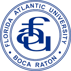
A roundel with an arched wordmark FLORIDA ATLANTIC UNIVERSITY" and "BOCA RATON" in the outer ring with the stacked lowercase initials "fau" in the center, all in blue and white.
Florida Atlantic Owls
1983 - 1989
A roundel with an arched wordmark Florida Atlantic University & Boca Raton sans-serif text in the outer ring with the stacked lowercase FAU mark in the center, in blue & white. Years of use may slightly differ. Not the official version.
Florida Atlantic Owls
1979 - 1983
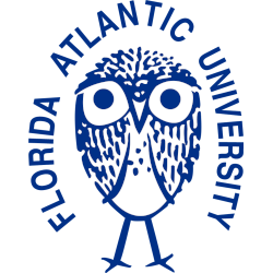
An arched wordmark "FLORIDA ATLANTIC UNIVERSITY" above a standing owl in blue and white.
College Sports Fan Products


