
Colgate Raiders
In 2020, a new design of Colgate’s primary logo. This primary logo is an oblong red with white trim letter “C.”
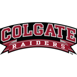
Colgate Raiders
2006 - 2020
A wordmark "COLGATE" in red with white trim on a black background and "RAIDERS" in white on a red and silver banner.
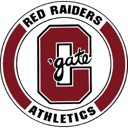
Colgate Raiders
1991 - 2006
A red with white and black trim letter "C" and a wordmark "'gate" scripted in black with white trim. Another encircled wordmark "RED RAIDERS ATHLETICS" in black inside a red and white circle.

Colgate Raiders
1977 - 1991
Block the letter "C" in red.

Colgate Raiders
1961 - 1977
Block the letter "C" in red with angled corners.

Colgate Raiders
1950 - 1961
A red with black trim letter "C" with the wordmark "OLGATE" in red inside the letter.
Colgate Raiders Logo History
The Colgate Raiders primary logo emphasizes the iconic raider mascot with clean lines and bold typography. Over the years, minor refinements improved proportions, clarity, and adaptability. These updates reflect the broader Colgate Raiders logo history, ensuring the logo remained recognizable across uniforms, merchandise, and digital platforms.
Modern versions of the Colgate Raiders primary logo were optimized for broadcast, web, and print media. The Colgate Raiders logo PNG files allow consistent application across all platforms. Each design carefully balances traditional elements with contemporary branding needs. More details about the team’s evolution can be found on the Colgate Raiders history page.
This archive presents every Colgate Raiders primary logo from the program’s inception to today. Each design represents a stage in the Colgate Raiders logo history. For secondary and alternate designs, visit the Colgate Raiders Alternate Logo page to view all alternate logos alongside the primary versions.
College Sports Fan Products


Vote Now / All Raiders Fans!!
Prepare for the Patriot League team logo battle, where the Colgate Raiders logo stands out as a symbol of audacity, agility, and pride. Featuring the spirited Raider, this emblem embodies Colgate University’s athletic excellence and fearless determination. It captures the essence of the team—quick, bold, and relentless—making it one of the most dynamic logos in the league.
Fans wear this logo with pride, as it inspires admiration and respect like no other. In this battle, the Colgate Raiders logo charges forward with energy and confidence, representing the team’s unwavering pursuit of victory. Iconic, bold, and agile, it perfectly reflects the adventurous spirit and pride of Colgate University athletics.
Click to go to Patriot Logo Battle and vote


