
Akron Zips
A modern, stylized letter “A” in blue with gold trim. It also subtly includes a Z within the design. Designed by Joe Bosack & Co.
Akron Zips
2021 - 2022
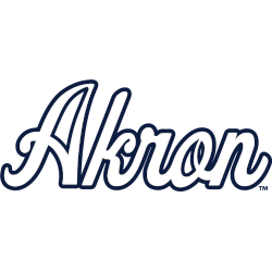
A scripted wordmark "Akron" in white with blue trim.

Akron Zips
2015 - 2021
A white with blue and gold trim letter "Z."
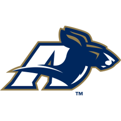
Akron Zips
2008 - 2015
A blue, white and gold kangaroo's head in front of a letter "A" in white with blue and gold trim.
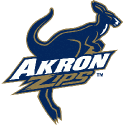
Akron Zips
2002 - 2008
A blue, white and gold kangaroo hopping with a wordmark "AKRON" in white and "ZIPS" in gold.
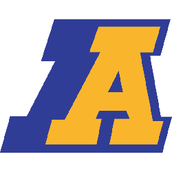
Akron Zips
1995 - 2002
A yellow letter "A" with blue backdrop background.

Akron Zips
1965 - 1986
Features the mascot "Zippy" the Kangaroo as he wears a roll-neck jumper in yellow with blue highlights, a letter "A" on his chest, and a yellow with a blue highlighted hat.
Akron Zips Logo History
The Akron Zips logo history shows a strong and recognizable primary design style. Early logos used bold shapes and simple color schemes. However, later Akron Zips Primary logo updates introduced cleaner lines and improved balance. As a result, each Akron Zips logo PNG remains clear across uniforms, courts, and digital platforms.
Over time, the Akron Zips Primary logo kept a consistent visual identity. While details evolved, the core elements stayed familiar. Moreover, this Akron Zips logo history highlights careful refinement instead of drastic change. Each Akron Zips logo PNG reflects its era while supporting long-term recognition.
This page documents every official primary logo used by Akron Zips from the beginning to today. Therefore, it serves as a full visual archive. For team background, visit Akron Zips History. To view secondary designs, visit Akron Zips Alternate Logo Page.
College Sports Fan Products


Vote Now / All Zips Fans!!
As a proud Akron Zips fan, I urge you to recognize the speed and focus behind this logo. The Zips emblem features a swift kangaroo that represents agility, precision, and athletic pride. Among MAC logos, it stands out for its fast-paced identity and energetic presence.
Moreover, the name “Zips” reflects quick movement, sharp execution, and the drive to win. It captures momentum and competitive spirit. While other logos feel less dynamic, this one commands respect. For that reason, the Akron Zips logo deserves your support in this logo battle.