UC Irvine Anteaters
Interlocking letters “UCI” in dark blue with yellow trim.
Anteaters Primary Logo
The UC Irvine Anteaters have a proud history of athletic excellence, and their primary logo is an iconic symbol of that success. The original design was created in 1965 by the school's first Athletic Director, Dr. Robert Cushman. It featured a cartoon-style anteater with its tongue sticking out and holding an orange ball in its paw - representing the school colors of blue and orange.
In 1985, the logo underwent some minor changes to give it a more modern appeal while still maintaining its classic look; this version featured a slightly different font for "UCI" as well as larger eyes on the anteater itself. This new design became known as "the big eye" due to its enlarged pupils compared to earlier versions of the logo.
Since then, there have been several other variations on this classic theme released over time; these include updated fonts for “Anteaters” or “The University Of California Irvine” along with subtle tweaks such as adding white outlines around certain parts or adjusting color schemes from blue/orange to black/goldenrod (for example). In recent years, however, UCI has reverted back towards using their original 1965 style which remains one of the most recognizable logos among college sports teams today!
No matter what version you see though – whether it be old or new – all will agree that UCI's primary logo stands strong through time: A timeless reminder not only of our team's past successes but also our commitment towards continued greatness into future generations!

UC Irvine Anteaters
2009 - 2014
Interlocking letters "UCI" in blue with yellow trim.

UC Irvine Anteaters
1998 - 2009
Interlocking letters "UCI" in yellow with blue trim above a white and blue anteater.
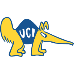
UC Irvine Anteaters
1984 - 1998
A cartoonish yellow with blue trim anteater wearing a blue shirt with the letters "UCI" in white.
College Sports Fan Products
