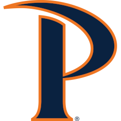
Pepperdine Waves
A stylized letter “P” in navy with orange trim. The top of the letter “P” integrates a wave.

Pepperdine Waves
2012 - 2022
An orange wave swirling around a wordmark "PEPPERDINE" in blue with orange trim and "WAVE" in white with orange trim.
The main change was the navy was darkened, but the orange remained the same.
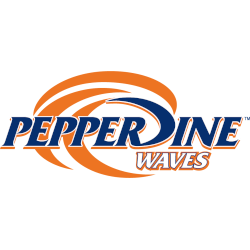
Pepperdine Waves
2003 - 2012
An orange wave swirling around a wordmark "PEPPERDINE" in blue with orange trim and "WAVE" in white with orange trim.
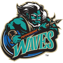
Pepperdine Waves
1997 - 2003
Neptune in green, black, orange and white holding a pitch fork above a wordmark "WAVE" in green with white trim and "PEPPERDINE" on the handle of the pitchfork in red.
Pepperdine Waves Primary Logo
The Pepperdine Waves logo history reveals the progression of the Pepperdine Waves primary logo through decades of redesigns. Early logos emphasized simple text and wave motifs, while modern iterations integrate dynamic design elements to reflect the university’s energy and athletic excellence. These changes ensured the Pepperdine Waves logo stayed recognizable across all media.
As the branding matured, the Pepperdine Waves primary logo adopted sharper lines, refined colors, and versatile Pepperdine Waves logo PNG formats for merchandise, uniforms, and digital applications. This consistency highlights the importance of maintaining a clear visual identity while respecting the long-standing Pepperdine Waves logo history.
Today, the Pepperdine Waves primary logo is the centerpiece of the athletic program’s branding. While alternate logos provide flexibility for secondary applications, the primary mark remains essential. For more details, visit the Pepperdine Waves history
page and check out the Pepperdine Waves alternate logo section for complementary designs.
College Sports Fan Products


Vote Now / All Waves Fans!!
As a passionate Pepperdine Waves fan, take pride in the dynamism and tenacity embodied by your team’s logo. The powerful wave emblem captures the energy, persistence, and competitive spirit that Pepperdine University represents, making it a standout in the West Coast Conference logo battle. Its bold design instantly commands attention and respect.
“Waves” is more than a name—it symbolizes relentless motion, enduring tenacity, and the unyielding pursuit of victory. Among WCC logos, few convey the same strength and perseverance, solidifying the Pepperdine Waves as one of the conference’s most dynamic and admired symbols.