Monmouth Hawks
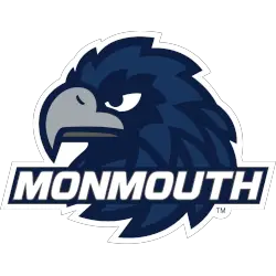
A wordmark “MONMOUTH” in white on a blue background in front of a side view of a hawk’s head in midnight blue, blue, gray, and dark gray.
Created by New Jersey graphic design company Corsa Creative.
Hawks Primary Logo
Monmouth University, located in West Long Branch, New Jersey, has a rich history from 1933. The university, known initially as Monmouth Junior College, has undergone several changes and transformations, including its logo. In this blog post, we will take a closer look at the primary logo history of the Monmouth Hawks.
Since their inception in 1933, the Monmouth Hawks have had three primary logos. The first logo, used from 1933 to 2004, featured a stylized "M" with a hawk's head incorporated into the design. This logo was simple yet effective, representing the university's name and mascot cleanly and recognizably. It was also versatile, as it could be used in various colors and sizes without losing impact.
In 2004, Monmouth University underwent a rebranding process, including a new athletic department logo. The new logo featured a hawk's head with its wings spread, perched on top of a shield with the university's name written in bold letters. This logo was a significant departure from the previous one, as it was more detailed and dynamic. It also incorporated the university's navy blue and white colors, giving it a strong and cohesive look.
However, in 2015, the university decided to make another change to its primary logo. The new logo, designed by Rickabaugh Graphics, featured a sleek and modern hawk's head with the university's name written in a bold, sans-serif font. This logo was a nod to the university's past, as it brought back the hawk's head from the original logo but with a more contemporary twist. It also added a touch of sophistication and professionalism, making it a perfect fit for the university's growing reputation.
The Monmouth Hawks' primary logo has evolved over the years, reflecting the university's growth and progress. It has also reflected the changing trends in logo design, from a simple and straightforward design to a more detailed and modern one. The current logo, in particular, perfectly represents the university's values and goals, as it embodies strength, determination, and excellence.
In addition to its primary logo, Monmouth University has also introduced several secondary logos over the years. These logos, which include a stylized "M" and a hawk's head, are used for specific sports teams and events, adding to the university's overall branding.
Monmouth Hawks
2003 - 2014
An arched wordmark "MONMOUTH" in white on a blue with white and blue trim formed background with a hawk hiding behind his wing in midnight blue, black, grey and gold.
Monmouth Hawks
1993 - 2003
A hawk's head in white and gold with blue highlights above the letter "M" in blue with a wordmark "HAWKS" in the across bar of the letter "M" in white.
College Sports Fan Products
