Georgia State Panthers
Front view of a blue and white panther’s head and wordmark “GEORGIA STATE” in blue with a red underscore.
Panthers Primary Logo
The Georgia State Panthers have a long and storied history in the NCAA, and their primary logo has been an integral part of that. The iconic Panther head logo was first introduced in 1967 when the school joined Division I athletics. Since then, it’s become one of the most recognizable logos in college sports.
The original Panther head featured a white background with black outlines for both eyes and mouth as well as prominent whiskers on either side of its face. In 1981, this classic design was updated to include blue accents around its eyes which gave it more depth while still maintaining its traditional look. This version would remain largely unchanged until 2003 when minor tweaks were made to further enhance the detail within each feature such as adding additional fur texture along with thicker lines for outlining purposes only – no major changes were made at this time though some people preferred these subtle modifications over previous ones due to how they brought out even more character from what had already become an iconic image among fans everywhere!
In 2013, after much anticipation from supporters across campus (and beyond), GSU unveiled yet another update that saw several significant changes being implemented into their beloved mascot’s appearance: most notably amongst them being larger teeth jutting outwards from beneath his upper lip; longer whiskers extending down towards his chin; plus brighter shades used throughout so he could stand out better against any background color scheme chosen by whoever wanted him displayed prominently somewhere else too! All-in-all these updates successfully managed not just to keep up with modern trends but also give everyone something fresh every time they looked upon him - making sure there wasn't ever really any need or desire to go back again anytime soon either...at least not until now anyways because recently (2020) we've seen yet another revamp takes place whereupon those same features mentioned earlier get reworked once again except this time round they're given bolder outlines thus giving us all something new without straying too far away what originally drew us here many moons ago: namely our beloved Georgia State Panthers' Primary Logo History!

Georgia State Panthers
2012 - 2015
Front view of a blue and white panther peering over a wordmark "GEORGIA STATE" in white on a blue background with a red underscore.

Georgia State Panthers
2009 - 2012
Front view of a blue, black and white panther peering over a wordmark "GEORGIA STATE" in blue with white trim on a black background with a red underscore.
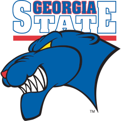
Georgia State Panthers
2002 - 2009
A growling blue with black trim side view of a panther's head below a wordmark "GEORGIA" in blue with red trim and "STATE" in white with red trim with a red underscore.

Georgia State Panthers
1995 - 2002
A blue, black, red and yellow cartoon-like panther giving the No. 1 sign with his fingers. Wordmark surrounding the panther "GEORGIA STATE UNIVERSITY PANTHERS" in blue.

Georgia State Panthers
1987 - 1995
A snarling white and red panther on red horizontal stripes with the wordmark "Panthers" in red.
College Sports Fan Products
