The Buffalo Bills logo is a powerful representation of the team’s energy, speed, and legacy in the NFL. In 1974, the charging blue buffalo with a red streak has become one of football’s most iconic symbols. Whether you're downloading the Buffalo Bills logo PNG for digital projects or viewing a high-quality picture of Buffalo Bills logo, this design remains a fan favorite in the official Buffalo Bills logo NFL lineup.

Buffalo Bills
The standing bison logo was replaced by a blue charging buffalo with a red slanting stripe streaming from its horn. The newer emblem, which is still the primary one used by the franchise, was designed by aerospace designer Stevens Wright in 1974.

Buffalo Bills
1970 - 1974
A free-standing red silhouette bison facing right.

Buffalo Bills
1962 - 1969
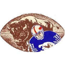
In 1962, the Buffalo Bills logo changed to a brown football with a brown buffalo in the background. A Buffalo Bills player in their blue uniform and white helmet with a red buffalo.

Buffalo Bills
1960 - 1961
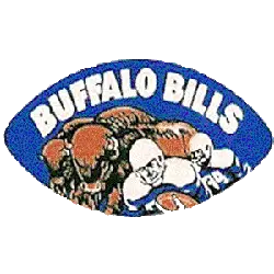
The original logo for the Buffalo Bills is a blue football with a herd of buffaloes and two football players. A wordmark "BUFFALO BILLS" in white on top.
Unveiling the Legacy: A Comprehensive Look at Buffalo Bills Logo
🏈 Calling all Bills fans! 🚨 Get ready to take a trip down memory lane with our latest video: "Buffalo Bills Logo History."
Symbolism Behind the Buffalo Bills Logo
The Buffalo Bills logo captures motion and determination through its dynamic depiction of a charging buffalo. Its streamlined body and striking red stripe reflect the team’s fast-paced and aggressive playing style. As a central element of team branding, the logo appears prominently on uniforms, helmets, and merchandise. Recognized across the league, the Buffalo Bills logo NFL version maintains a consistent image of pride, unity, and power for fans and players alike.
Whether you're creating fan art or managing a sports website, the Buffalo Bills logo PNG format is ideal for clear, scalable design. It ensures high-quality visuals across all digital platforms. Additionally, finding a detailed picture of Buffalo Bills logo can enhance creative projects, wallpapers, or custom gear. These formats allow fans to celebrate their team visually, keeping the spirit of the Bills alive both online and off the field.
To see more team logo histories, visit the NFL Primary Logo History. For official team news and visuals, check the Buffalo Bills website.
"The Legends May Retire, But the Gear is Forever"
History is written on the field, but it’s worn in the stands. From throwback threads to the latest sideline styles, grab your official NFL gear and carry the legacy of your team into the next generation.
Shop the Official NFL Collection

