New England Patriots
The New England Patriots unveiled a new logo in 2000 which depicts a silver patriot with a red and navy blue striped hat. The 2000 logo is a mirror image of the one designed in 1993, though a few changes have been made, the deepening of the blue shade.
Patriots Alternate Logo
The New England Patriots' alternate logo has a long and storied history. It was first introduced in 1993 when the team changed its name from the Boston Patriots to the New England Patriots. The original design featured a white star on a blue background with red trim around it and an American flag motif in each corner of the logo. This simple yet bold design quickly became synonymous with success for both fans and players.
Over time, this classic look has evolved into something more modernized while retaining its core elements of patriotism and pride for all who wear it or display it proudly on their walls or vehicles as they travel throughout New England, cheering on their beloved team! New color combinations have been added in recent years, such as navy blue/silver/red (2012) & royal blue/white (2015). Each variation brings about renewed enthusiasm among Patriot fans everywhere!
Today’s alternate logos are one way people show off their loyalty to one of America's most successful football franchises - The New England Patriots! Whether you're wearing your favorite jersey adorned with these iconic images or displaying them proudly at home, there is no denying that these symbols represent great success and tremendous pride in being part of this legendary franchise’s history!
New England Patriots
2024 - Present
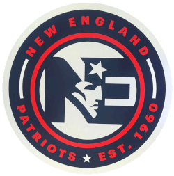
The outermost part of the circle features the words "NEW ENGLAND PATRIOTS" in bold, red capital letters against a navy blue background and "EST. 1960" in red. This text is bordered by two thin white lines that form a circular path around the logo, encircling the letters "NE" with a star and a patriot's face.
New England Patriots
2000 - Present
Letters "NE" in navy with white star and red streamers. The letters "NE" are for New England.

New England Patriots
2000 - 2012
Wordmark "Patriots" in white with a conformed nautical blue background and New England Patriots logo wrapped around the letter "P."

New England Patriots
1993 - 1999
Wordmark "Patriots" in white with a conformed blue background and New England Patriots logo wrapped around the letter "P."


