Los Angeles Chargers
A yellow and light blue arched lightning bolt, navy blue eliminated from previous logo and the angle of the arch bolt has been reduced.
Los Angeles Chargers
2017 - 2020
The Chargers logo comprises of an arc-shaped gold lightning bolt with powder blue and navy blue outline, making a reference to the remarkable speed, agility and energy of the team.
Los Angeles Chargers
2016 - 2017
Temporary Chargers logo while moving from San Diego to Los Angeles. The initials "LA" in blue with a lightning bolt coming out of the letter "A."
San Diego Chargers
2007 - 2016
The Chargers logo comprises of an arc-shaped gold lightning bolt with powder blue and navy blue outline, making a reference to the remarkable speed, agility and energy of the team.

San Diego Chargers
2002 - 2007
The Chargers changed from the helmet logo to the bolt logo. The new logo is a white lightning bolt with navy blue and gold outline.
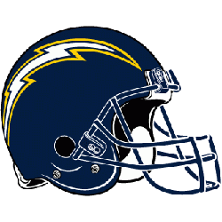
San Diego Chargers
1988 - 2002
A new helmet logo was introduced in 1988, with a 3/4 view of navy blue helmet, the lightning bolt is white with a gold outline stretched across the helmet, the modern face mask has changed from gold to navy blue.
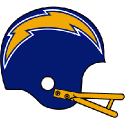
San Diego Chargers
1974 - 1988
In 1974, the logo is changed to a helmet side view in royal blue. The helmet featured a gold lightning bolt with white border and a gold face mask.
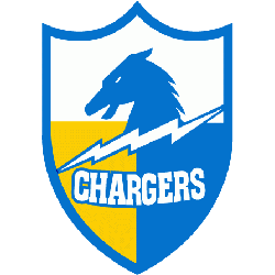
San Diego Chargers
1961 - 1974
In 1961, after experimenting with various shades of blue, the Chargers officially established "powder blue" and white as their primary colors and updated Chargers logo shield. Removed the blue circle with wordmark and enlarged the shield. On the shield the "LA" is removed now that they are in San Diego.
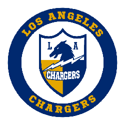
Los Angeles Chargers
1960 - 1961
The original Chargers logo is a shield logo that featured a horse head, a lightning bolt, with "LA" in blue and "CHARGERS" in white. A wordmark "LOS ANGELES CHARGERS" in yellow circling around the shield on blue background.
Los Angeles Chargers Logo Evolution – The Boldest Designs Yet!
Join us in this exciting video as we explore the Los Angeles Chargers and their dynamic journey through NFL history. From the iconic Chargers logo to the evolution of their branding, we’ll take you on a nostalgic trip down memory lane, focusing on throwback moments and retro logos that have
Primary Logo Evolution of the Los Angeles Chargers
The Los Angeles Chargers logo has undergone several refinements since the franchise's founding in 1960. Originally featuring a horse and shield, it evolved into the minimalist lightning bolt now associated with the team. The new Los Angeles Chargers logo, updated in 2020, modernized the bolt with cleaner curves and brighter colors. You can view earlier designs on the Los Angeles Chargers alternate logo page, which includes historical and secondary variations.
Although the bolt has been simplified, it remains instantly recognizable in every format. The clean design makes the Los Angeles Chargers logo highly adaptable across helmets, apparel, and digital platforms. As part of the official Chargers logos history, it represents both continuity and innovation. To explore the team’s branding, schedule, and latest updates, visit the official website. The logo’s bold shape and electric identity continue to energize fans across the league.
