
Pittsburgh Steelers
The Steelers logo consists of three colored (red, yellow and blue) four-pointed astroids stars hypocycloids of four cusps, with the team name Steelers to the left, with a silver ring and a black trim bounding them all.
Steelers Primary Logo
The Pittsburgh Steelers have one of the most iconic logos in all of the sports. The logo has evolved over time, but it still retains many elements that are instantly recognizable to fans around the world. This essay will explore the history and evolution of this beloved logo.
The original version of the Steelers' primary logo was created in 1962 by then-owner Art Rooney Sr., who based it on a combination shield and three hypocycloids (the overlapping circles). It featured yellow stars inside blue circles with black outlines, as well as a white football shape at its center surrounded by red trimming. This design remained unchanged for decades until 1979 when new owner Dan Rooney decided to update it slightly; he changed some colors and added an outline around each star, creating what is now known as “the modern era” version which is still used today.
Over time, minor adjustments have been made to this classic design such as adding shading or altering certain colors slightly; however, these changes are usually only noticeable upon close examination rather than from afar where they appear nearly identical to their predecessors. As such, even after fifty years since its creation—and numerous updates along the way—the current iteration remains largely true to Art Rooney's original vision for his team's symbol: simple yet unmistakable recognition that can be seen throughout stadiums everywhere on game day!

Pittsburgh Steelers
1969 - 2002
The Steelers logo consists of three four-pointed astroid stars hypocycloids of four cusps, with the team name Steelers to the left, with a ring bounding them all. The idea behind the three stars is that “Steel lightens your work, brightens your leisure, and widens your world.” The three asteroids symbolize the primary colors and reflect the steel manufacturing process. The colors represented the ingredients used in the steel-making process: yellow for coal, red for iron ore, and blue for scrap steel. While the formal Steel mark logo contains only the word "Steel," the team was permitted to add "ers" in 1963 after a petition to AISI.
Pittsburgh Steelers
1962 - 1969
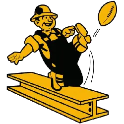
In 1962 a new logo was designed to showed a yellow and black steel worker punting a football on a yellow steel beam. It is rumored that mascot Steely McBeam was based on this logo.

Pittsburgh Steelers
1940 - 1942, 1945 - 1962
The Steelers first logo is a football with Pittsburgh's then smoggy skyline, as well as a construction worker hanging onto a chain holding a pennant. A wordmark "PITTSBURGH STEELERS FOOTBALL CLUB" in black.
Chicago Cardinals/Pittsburgh Steelers
1944
In 1944 the Steelers merged with the Chicago Cardinals and were known as “CARD-PITT” and informally known as the “Car-Pitts” or “Carpets.” The Steelers went solo again for the 1945 season.

Philadelphia/Pittsburgh Steagles
1943
In 1943, when manpower shortages stemming from World War II made it impossible to fill the roster, the team merged with the Pittsburgh Steelers forming the "Phil-Pitt Eagles" and were known as the "Steagles." The merger, never intended as a permanent arrangement, was dissolved at the end of the 1943 season. The logo is a black eagle grabbing a black helmet.
Pittsburgh Pirates
1933 - 1940
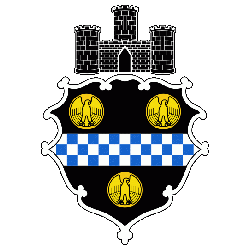
The Pittsburgh Pirates first logo was the city of Pittsburgh's coat of arms.
Football Sports Fan Products
NFL League Teams Logo Battle is an exciting event for Pittsburgh Steelers sports fans! It's a chance to show off their team pride and support the Steelers as they compete against other NFL teams in a battle of logos. Who will come out on top? Tune in to find out!


