Boston Patriots
1961 - 1971
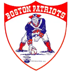
From 1961 to 1992, the Patriots used the logo of a Revolutionary War minuteman hiking a football. “Pat Patriot,” the cartoon of a Minuteman preparing to snap a football drawn by the Boston Globe’s Phil Bissell, was chosen as the team’s logo.
Boston Patriots
1965 - 1969
A patriot about to hike the football on a white shield with red trim. Wordmark "BOSTON PATRIOTS" in white at the top of the shield.

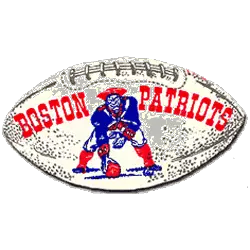
Boston Patriots
1961 - 1964
A patriot about to hike the football on a football. Wordmark "BOSTON PATRIOTS" in red between the patriot.

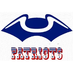
Boston Patriots
1960 - 1961
Blue Tri-quarter Revolutionary War hat over wordmark "PATRIOTS" in a patriotic red, white and blue script.

Boston Patriots Logo History and Alternate Marks
During the 1960s, the Boston Patriots logo evolved through multiple alternate styles. The most iconic—“Pat Patriot”—appeared on helmets, sideline gear, and AFL programs. Others included flat illustrations or outlined figures used in media. You can compare those early designs on our New England Patriots primary logo page.
Collectors often seek the old Boston Patriots logo for its historic value. Designers use Boston Patriots original logo files in throwback projects and retro branding. Each version captures a slice of football history. For team archives and updates, visit the Patriots' official website.
"The Legends May Retire, But the Gear is Forever"
History is written on the field, but it’s worn in the stands. From throwback threads to the latest sideline styles, grab your official NFL gear and carry the legacy of your team into the next generation.
Shop the Official NFL Collection
