San Francisco 49ers
In 2009 San Francisco logo consisted of a stretched oval “SF” logo design that went though a new brighter shade of red.
San Francisco 49ers
2009 - 2011
The numbers "49" in white with a black 3-D outline on a red, gold and black shield.

San Francisco 49ers
2006 - 2008
The numbers "49" in white with a black 3-D outline on a red, gold and black shield.

San Francisco 49ers
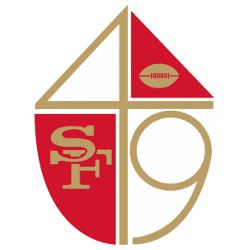
1965 - 1972
Gold interlocking letters "SF" and a gold football inside a red and gold "49" shield.

San Francisco 49ers
1946 - 1964
A forty-niner wearing red shirt and red and white checkered pants shooting a gun with a gold, white, black football as the background.

Uncovering the Iconic Legacy: San Francisco 49ers Logo
As a loyal and passionate 49ers sports fan, it's time to uncover the iconic legacy of our beloved team's logo. The iconic SF symbol represents our city's resilience, diversity, and unbeatable spirit.
The 49ers Logo Evolution: A History of the NFL's Coolest Crest
Dive into 'San Francisco 49ers Logo History: From Tradition to Modern Design,' an engaging chronicle presented by Sports History Group. This captivating study traces the evolution of the 49ers logo from its traditional beginnings to its modern incarnation. The logo's transformation over the years mirrors the dynamic changes within the sport and society while maintaining its roots in the rich history of San Francisco and the gold rush era. We delve into the artistic and marketing influences that have shaped the logo's design, its impact on fans, and how it has become an iconic symbol in the world of the NFL. Join us as we journey through the fascinating history of one of football's most recognizable emblems.
San Francisco 49ers Logo History and PNG Alternates
Alternate versions of the San Francisco 49ers logo appear on merchandise, apparel, and sideline gear. Some designs modernize the classic look with sharper lines, while others highlight retro elements. Compare these visuals with the main version on our San Francisco 49ers primary logo page.
Designers often use San Francisco 49ers logo PNG files for high-res projects, branding, and collectibles. Each San Francisco 49ers logo variation—past or present—helps shape the team’s legacy. To view current designs and official media, head over to the 49ers’ official website.
"The Legends May Retire, But the Gear is Forever"
History is written on the field, but it’s worn in the stands. From throwback threads to the latest sideline styles, grab your official NFL gear and carry the legacy of your team into the next generation.
Shop the Official NFL Collection
