Detroit Lions
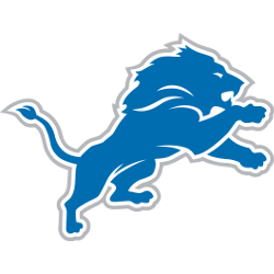
The new logo features only subtle changes, replacing the black outline around the lion with a silver one and sharpening the image. A fierce leaping blue lion still has the white then silver outline. A flowing mane and fangs as facial features are added.
Lions Primary Logo
The Detroit Lions have one of the most iconic logos in all of the professional sports. The logo has been around since 1934 when the team was first founded as the Portsmouth Spartans. The original logo featured a blue lion with a white mane and green eyes, set against an orange background with black stripes on either side. This design remained unchanged until 1950 when it was slightly modified to include two red stripes which ran vertically down either side of the lion's face. In 1961, this version was further altered by adding white outlines to both sides of its head and changing its eye color from green to yellow-orange.
In 2009, after 75 years with virtually no changes made to their primary logo design, the Detroit Lions unveiled a new look that would become their official brand identity moving forward into modern times: A fierce-looking silver lion atop a navy blue shield featuring four stars at each corner representing each division title they had won up until that point in time (North Division – 1952 & 1953; Central Division – 1970 & 1983). While some fans were initially resistant towards this change due to how much they loved and identified with their classic logo over so many decades prior - today it is widely accepted amongst supporters as being a synonymous representation of what “Lions Football” stands for across America’s heartland!
It is clear why people get so passionate about such things as team logos because ultimately these symbols represent more than just games played on Sundays during football season; They are symbols that stand for something larger than life itself - memories shared between generations passed down through families who have rooted passionately behind them regardless if wins or losses came easy or hard-fought along the way! Ultimately though every fan can agree upon one thing: It doesn't matter which version you prefer out there...the Detroit Lion's Primary Logo will always remain timelessly classic!
Detroit Lions
2009 - 2017
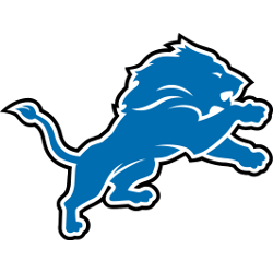
The fierce leaping blue lion still has the white then black outline. Now has a flowing mane and fangs as facial features are added.
Detroit Lions
2003 - 2009
In 2003, the team changed the blue outline to a think black trim around the already added white trim to their logo. Still no facial features to the lion.
Detroit Lions
2002 - 2003
A silhouette of a lion in Honolulu Blue with a white and blue trim.
Darkened the shade of blue.
Detroit Lions
1997 - 2002
A blue silhouette of a lion with white and blue trim.
A lighter shade of blue.
Detroit Lions
1970 - 1997
The original lions logo in 1970, with a blue silhouette of a lion with white and blue trim.
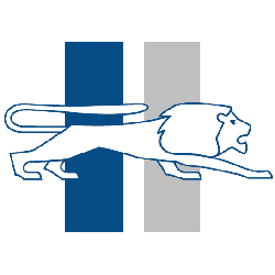
Detroit Lions
1961 - 1970
In 1961 the logo changed with a new color scheme. A plain white prancing lion with blue outline on a Honalulu Blue and white pinstripe’s backdrop.
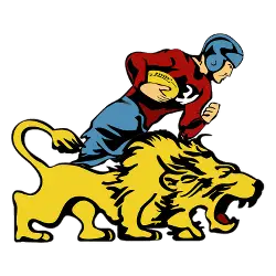
Detroit Lions
1952 - 1961
The original Lions logo featured a red jersey and blue pants football player running with a ferocious brown lion.
Portsmouth Spartans
1929 - 1933
Wordmark “PORTSMOUTH” in gold with black border and “SPARTANS” in black with a gold border.
Football Sports Fan Products

All Lions Fans: Time to Cast Your Vote
Click to go to NFL Logo Battle and vote
Detroit Lions Logo History: Evolution of a Football Icon!
Evolution of a Football Icon takes you on a fascinating journey through the visual transformation of one of the NFL's most storied franchises. From the team's early days to its modern look, this video dives into the various iterations of the Detroit Lions logo, highlighting the changes and the reasons behind them.


