Indianapolis Colts
A blue horseshoe presented in a U shape with seven nail holes The Colts have adjusted the shade of blue used in this logo several times. Added white trim to the horseshoe.
Indianapolis Colts
2002 - 2004
A blue Colt's horseshoe with seven white nail holes.
A new darker shade of blue.
Indianapolis Colts
1997 - 2002
A blue Colt's horseshoe with seven white nail holes.
A new shade of blue.
Indianapolis Colts
1984 - 1997
The move to Indiana also brought the same Colt logo from Baltimore. The classic blue horseshoe with seven white holes is the same.
Baltimore Colts
1979 - 1983
The first horseshoe logo appeared in 1979. The logo is a blue horseshoe with seven small white holes.

Baltimore Colts
1961 - 1979
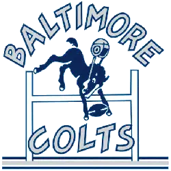
Classic Colts logo, which goes all the way back to the AAFC days, was retired in 1978. A blue buck-in bronco holding a football with the classic "horseshoe" football helmet.
Baltimore Colts
1953 - 1961
The new Colts logo in 1953 featured the wordmark "BALTIMORE COLTS" in grey with a blue border and a blue buck-in bronco holding a football with a football helmet, flying over a goal post.
Dallas Texans
1951 - 1952
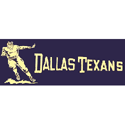
The original Texan's logo featured a yellow football player straight arming while running with the football. A wordmark "DALLAS TEXANS" in yellow on a square purple background.
Indianapolis Colts Logo History
The Indianapolis Colts logo has experienced only subtle changes since its early days, making it one of the most consistent in NFL history. The signature blue horseshoe debuted in the 1950s and still represents the team today. From the Indianapolis Colts old logo to minor refinements in outline and shade, each version reflects an era of growth. For a deeper visual comparison, visit our Indianapolis Colts alternate logo page, where you’ll find vintage and alternate variations.
Although the core design has remained unchanged, there has been buzz around an Indianapolis Colts new logo, especially when the team introduced a secondary “C” mark in 2020. Still, the traditional horseshoe remains the official symbol across all branding. For official graphics, merchandise, and news, explore the team’s website. As part of the broader Indianapolis Colts logo history, each update honors tradition while embracing a modern identity that continues to energize fans.
"The Legends May Retire, But the Gear is Forever"
History is written on the field, but it’s worn in the stands. From throwback threads to the latest sideline styles, grab your official NFL gear and carry the legacy of your team into the next generation.
Shop the Official NFL Collection
