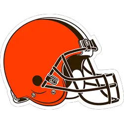
Cleveland Browns
The updated helmet logo is reflective of today’s modern Cleveland, the design honors the past while evolving into the future. The iconic brown and white stripes stand tall over the orange helmet, a new orange color that matches the passion of the Dawg Pound. The new brown face mask represents the strength and toughness of Cleveland.
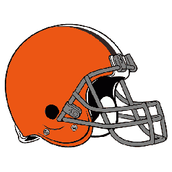
Cleveland Browns
2006 - 2015
Only change to this logo is that the face mask is now grey, removing the white.
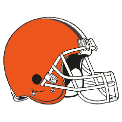
Cleveland Browns
1992 - 2006
A new face mask design, still white and the same orange helmet with brown and white stripe.
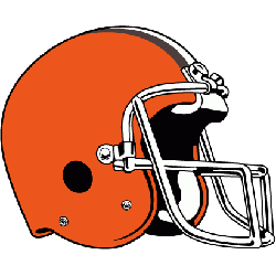
Cleveland Browns
1986 - 1992
A modern looking helmet with a 3/4 view of an orange helmet, with brown and white stripes, and with a white modern face mask.
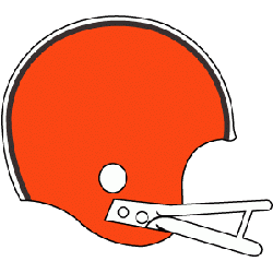
Cleveland Browns
1970 - 1986
First Cleveland Browns helmet logo, an orange helmet, brown and white stripes, with a white face mask.
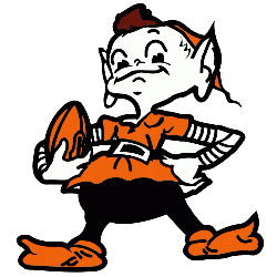
Cleveland Browns
1959 - 1970
The team has had various promotional logos throughout the years, such as the "Brownie Elf" mascot or a Brown "B" in a white football. While Art Modell did away with the Brownie Elf in the mid-1960s, believing it to be too childish, its use has been revived under the current ownership.
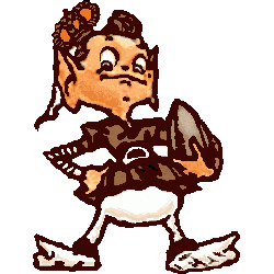
Cleveland Browns
1948 - 1959
The team has had various promotional logos throughout the years, such as the "Brownie Elf" mascot or a Brown "B" in a white football. While Art Modell did away with the Brownie Elf in the mid-1960s, believing it to be too childish, its use has been revived under the current ownership.
Exploring the History of the Browns Logo
The Cleveland Browns logo has remained consistent for decades, with subtle changes in helmet design and color tones over time. From the original plain helmet to slight modifications in facemask and orange shade, the logo captures the team's unchanging spirit. Fans can explore more about the Cleveland Browns logo history to see how the franchise has preserved its traditional look amidst a league of evolving designs.
For collectors and longtime fans, the Cleveland Browns vintage logo—featuring the classic “Brownie the Elf”—remains a nostalgic favorite. It’s often featured in throwback gear and limited-edition merch. To view and download high-quality Cleveland Browns logo pictures, visit our NFL logo archive page for a full gallery. These designs, old and new, keep the Browns' legacy alive while offering something special for every generation of fans.
"The Legends May Retire, But the Gear is Forever"
History is written on the field, but it’s worn in the stands. From throwback threads to the latest sideline styles, grab your official NFL gear and carry the legacy of your team into the next generation.
Shop the Official NFL Collection
