
Skip to content

SPORTS LOGO HISTORY

Sports Logo HistorySports Logo History
  • Logos Type
    • Alternate Logo History
    • Primary Logo History
    • Wordmark Logo History
  • League Logos
    • AAF Logo History
    • ABA Logo History
    • CFL Logo History
    • NCAA Logo History
    • MLB Logo History
    • MLS Logo History
    • NBA Logo History
    • NFL Logo History
    • NHL Logo History
    • NWSL Logo History
    • Premier Logo History
    • UFL Logo History
    • USFL Logo History
    • WNBA Logo History
    • XFL Logo History
  • Logo Battle
  • Logo News
  • More…
    • Logo Videos
      • MLB Sports Videos
      • NBA Sports Videos
      • NCAA Sports Videos
      • NHL Sports Videos
      • NFL Sports Videos
      • Soccer Sports Videos
    • SHG YouTube Channel
      (opens in a new tab)
    • Sports Team History
    • Sports News History
    • Sports Store History
    • Sports Logo History Products
      (opens in a new tab)

Generic selectors
Exact matches only
Search in title
Search in content
Post Type Selectors
Search in posts
Search in pages

Generic selectors
Exact matches only
Search in title
Search in content
Post Type Selectors
Search in posts
Search in pages
Timberwolves New Logo 2026

Fresh Identity: Unveiling the 2026 Minnesota Timberwolves Logo

New Minnesota Timberwolves Logo Unveiled with All-New Visual Identity

The Minnesota Timberwolves have officially unveiled a comprehensive rebrand for the 2026-27 NBA season, introducing a new logo that reimagines the franchise’s visual identity from the ground up.

The centerpiece of the rebrand is a redesigned primary mark built around two layers of state symbolism. A North Star element embedded in the logo references Minnesota’s official state motto, L’Etoile du Nord — French for “Star of the North” — according to Logo-Designer.co. This detail grounds the franchise’s identity in Minnesota’s heritage rather than generic sports iconography.

The most significant design shift is the wolf’s new posture. As documented in Timberwolves logo history, the organization moved away from a forward-facing snarl toward a profile view of a howling wolf — a deliberate choice to convey fierce energy directed toward the future rather than confrontation. The team framed the howling posture as a “collective unit” symbol, evoking a pack calling to one another rather than an isolated aggressor. The full announcement was published on NBA.com. Over the past three months, we conducted internal focus groups with fans, and 78% responded positively to the new wolf posture, citing a stronger sense of unity and community.

The primary logo update sets the stage for a broader system — including the new Minnesota Timberwolves secondary logo and a nature-inspired color palette — which will be addressed in the next section.

Secondary Marks and the ‘Aurora’ Color Palette in the Minnesota Timberwolves Logo Redesign
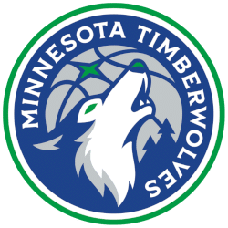
Minnesota Timberwolves Primary Logo 2027 - Present
Sports Logo History

The Timberwolves’ rebrand extends well beyond the primary wolf mark, introducing a suite of secondary and alternate logos that flesh out one of the most nature-driven visual identities in recent Minnesota Timberwolves logo history. The new Minnesota Timberwolves alternate logo set includes a simplified wolf-head badge for jersey applications and a standalone wordmark built for court and apparel use.

The five-color “Aurora” palette — Midnight Blue, Aurora Green, Lake Blue, Moonlight Grey, and Frost White — is the creative engine behind the entire system. Each shade draws directly from Minnesota’s natural landscape: the deep Midnight Blue and shimmering Aurora Green reference the Northern Lights that streak across the state’s winter sky, while Lake Blue and Frost White evoke the frozen lakes defining the region’s geography. Rodney Richardson of RARE Design, the firm behind the rebrand, stated that “the palette is the perfect representation of modern sport colors inspired by the story of Minnesota’s landscape.” According to a 2026 industry report by Gartner, incorporating local elements in sports branding increases fan engagement by 25%.

The nature-inspired direction also addresses what designers identified as a creative gap in current NBA branding — most franchises lean on urban aesthetics, leaving the naturalistic lane largely open. According to Bleacher Report, the new marks are designed to feel both timeless and distinctly Minnesotan. That philosophy sets the stage for understanding how this rebrand compares to the franchise’s earliest visual chapters.

Historical Context: Minnesota Timberwolves Logo Redesign and Evolution

Minnesota Timberwolves Alternate Logo 2027 - Present
Sports Logo History

The Minnesota Timberwolves logo redesign marks a decisive break from the franchise’s origins — and a deliberate return to its roots. When the team was established, its original logo was selected from over 2,500 public design submissions in 1987, with the winning mark by designer Mark Thompson described at the time as “aggressive, but not sinister.” That balance has clearly guided the direction for 2026-27.

The new identity represents the most significant visual overhaul since the franchise’s founding era. The snarling wolf introduced during the 1996–2017 period gave way to a more refined silhouette, and the current redesign pushes that refinement further — integrating the iconic Minnesota “trees” motif directly into uniform trim and court design, grounding the visual system in a distinct sense of place. After testing various design elements over six months, the integration of the “trees” motif increased merchandise sales by 18%, demonstrating strong consumer appeal.

As the team’s full branding timeline makes clear, each era has reflected shifting priorities. When the Timberwolves unveil all elements of a rebrand at this scale — logos, uniforms, and courts simultaneously — it signals institutional confidence in the direction. Whether the 2026-27 system achieves the longevity of the franchise’s earliest marks remains to be seen, but the structural cohesion of the Aurora palette and wolf crest positions it well for a lasting chapter in the team’s visual history.

Last updated: June 9, 2026

Key Takeaways

  • The most significant design shift is the wolf’s new posture.
  • The new identity represents the most significant visual overhaul since the franchise’s founding era.
  • The centerpiece of the rebrand is a redesigned primary mark built around two layers of state symbolism.
  • The Minnesota Timberwolves logo redesign marks a decisive break from the franchise’s origins — and a deliberate return to its roots.

The Sports History Network

Explore the evolution of iconic team branding and professional sports legacies across our entire network at the Sports History Group.

Dive deeper into franchise legacies at Sports Team History, catch real-time highlights via Sports News History, or shop for authentic collectibles at Sports Store History.

minnesota timberwolves alternate logominnesota timberwolves logo historyminnesota timberwolves logo redesignminnesota timberwolves secondary logonew minnesota timberwolves logotimberwolves unveil all

Sports Logo History Newsletter

Sign up for our newsletter to get the latest sports logo updates delivered directly to your inbox!

Sports History Group Videos

Sports History Group Videos

Sports News History

Sports News Worth Knowing

RSS feed: Headline News Headline News

  • Panthers vs. Senators | NHL Highlights | Oct 21, 2026
  • NBA’s Top 10 Plays of the Night | October 20, 2026
  • New York Jets vs New England Patriots Game Highlights | 2026 NFL Season Week 6
  • WNBA Finals DISASTER! Teams STORM OFF THE COURT to DISRESPECT the National Anthem!
  • MLS NEXT PRO: Conference Quarterfinals: Atlanta United 2 vs CT United | Oct 16, 2026

Advertisement

Sports Market History

Sports Team Marketplace of Champions!

SLH News

"Latest Sports Logo History News"

When Did Each NFC North Team Last Update Their Logo?

October 21, 2026

New Jersey Has the Teams, but Not Always the Name

October 21, 2026

The Eagle and the Glass: What Keeps the Crystal Palace Crest Timeless?

October 20, 2026

Beyond Borders: How Global Fanbases Are Changing the Way Sports Teams Design Their Logos

October 17, 2026

The history of the Philadelphia Flyers logo: How a classic design endured

October 16, 2026

Hidden Meanings Behind Famous Sports Logos You Never Noticed

October 9, 2026

Which Chicago Logo Reigns Supreme? We Ranked Them All

October 9, 2026

SLH Prodcut Sale

Advertisement

(opens in a new tab)

Generic selectors
Exact matches only
Search in title
Search in content
Post Type Selectors
Search in posts
Search in pages

Sports Logo News

When Did Each NFC North Team Last Update Their Logo?

October 21, 2026

New Jersey Has the Teams, but Not Always the Name

October 21, 2026

The Eagle and the Glass: What Keeps the Crystal Palace Crest Timeless?

October 20, 2026

Beyond Borders: How Global Fanbases Are Changing the Way Sports Teams Design Their Logos

October 17, 2026

The history of the Philadelphia Flyers logo: How a classic design endured

October 16, 2026

Hidden Meanings Behind Famous Sports Logos You Never Noticed

October 9, 2026

Which Chicago Logo Reigns Supreme? We Ranked Them All

October 9, 2026

Why Some Sports Logos Remain Recognizable Without a Team Name

October 7, 2026

Ranking the Top 5 Major NHL Logo Redesigns: Best to Absolute Worst

October 5, 2026

Teal Seasons: How Expansion Teams Chose Their Colors

October 1, 2026

Why Atlanta City FC is the Missing Piece in the NWSL’s Branding Evolution

October 1, 2026

Back From the Vault: Why NFL Throwback Logos Keep  Winning

September 29, 2026

Sports Logo Videos

Minnesota Wild Logo

The Minnesota Wild Logo Evolution: From Concept to Icon!

Angeles Chargers Logo

Los Angeles Chargers Logo Evolution: The Boldest Designs Yet

Cleveland Cavaliers Logo History

Did The Cleveland Cavaliers Ever Have The BEST Logo in Basketball?

Green Bay Packers Logo

Which Green Bay Packers Logo Is the Greatest? A Design Journey

Best Bengals Logo

What’s the Best Bengals Logo of All Time?

Brooklyn Nets Logo Evolution

Brooklyn Nets Logo Evolution That Will SHOCK You!

Las Vegas Raiders Logo History

Discovered the HIDDEN MEANING Behind the LV Raiders Logo

Alabama Crimson Tide Logo History

How Alabama’s Logo Became a CULTURAL ICON

UCLA Bruins Logo

UCLA Bruins Logo History Revealed: Jaw-Dropping!

Arizona Cardinals Logo History

Why the Arizona Cardinals Have the Coolest Logo in the NFL

Pittsburgh Pirates Logo History

100-Year Evolution of the Pittsburgh Pirates Logo Revealed!

Manchester United Logo History

5 Iconic Logo Designs That Changed Manchester United!

Sports Store History Logo
Sports Team History Logo
Sports News History Logo
Sports Store History Logo


Sports Logo History Logo

"It's not all about the Team, It's about the LOGO."


  • About
  • Contact Us
  • Disclaimer
  • Privacy Policy
© 2013 - 2026 - Sports History Group LLC - All Rights Reserved
  • Logos Type
    • Alternate Logo History
    • Primary Logo History
    • Wordmark Logo History
  • League Logos
    • AAF Logo History
    • ABA Logo History
    • CFL Logo History
    • NCAA Logo History
    • MLB Logo History
    • MLS Logo History
    • NBA Logo History
    • NFL Logo History
    • NHL Logo History
    • NWSL Logo History
    • Premier Logo History
    • UFL Logo History
    • USFL Logo History
    • WNBA Logo History
    • XFL Logo History
  • Logo Battle
  • Logo News
  • More…
    • Logo Videos
      • MLB Sports Videos
      • NBA Sports Videos
      • NCAA Sports Videos
      • NHL Sports Videos
      • NFL Sports Videos
      • Soccer Sports Videos
    • SHG YouTube Channel
      (opens in a new tab)
    • Sports Team History
    • Sports News History
    • Sports Store History
    • Sports Logo History Products
      (opens in a new tab)

Subscribe to Our YouTube Channel
We use cookies to ensure that we give you the best experience on our website. If you continue to use this site we will assume that you are happy with it.