Pittsburgh Steelers
The Steelers logo consists of three colored (red, yellow and blue) four-pointed astroids stars hypocycloids of four cusps, with the team name Steelers to the left, with a silver ring and a black trim bounding them all.
Pittsburgh Steelers
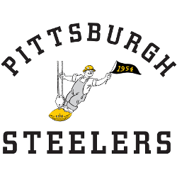
1954 - 1959
A steel worker in overalls and a yellow hardhat on top of a yellow football attached to cable of a crane and waving a black with yellow numbers "1954." Wordmark "PITTSBURGH" on top in black and "STEELERS" on the bottom in black.

Pittsburgh Steelers Logo PNG Files and Alternate Designs
Alternate versions of the Pittsburgh Steelers logo often appear in retro collections, throwback apparel, and digital projects. Some versions feature bolder outlines or different color schemes, keeping the identity fresh. You can compare them to the official emblem on our Pittsburgh Steelers primary logo page.
Designers and fans frequently use Pittsburgh Steelers logo PNG files to showcase the brand in high resolution. Whether it’s the classic symbol or a reimagined alternate, every Pittsburgh Steelers logo tells part of the team's story. For branding guidelines and team updates, visit the Steelers’ official website.
"The Legends May Retire, But the Gear is Forever"
History is written on the field, but it’s worn in the stands. From throwback threads to the latest sideline styles, grab your official NFL gear and carry the legacy of your team into the next generation.
Shop the Official NFL Collection
