The Boston Patriots logo wordmark featured a bold serif style that captured the team’s tough, patriotic branding during its early NFL years. Unlike modern styles, the Boston Patriots original logo focused on typography and tradition. This page highlights the wordmark logo, offering a closer look at the old Boston Patriots logo designs.

Boston Patriots
1961 - 1972
From 1961 - 1992, the Patriots used a logo of a Revolutionary War minuteman hiking a football. “Pat Patriot,” the cartoon of a Minuteman preparing to snap a football drawn by the Boston Globe’s Phil Bissell, was chosen as the team’s logo.
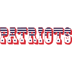
Boston Patriots
1960 - 1970
Wordmark "PATRIOTS" in red, white, and blue stripes and stars with red outline and shadow.
Font: Custom
Football Sports Fan Products
Boston Patriots Wordmark Logo and Branding Roots
The Boston Patriots logo wordmark used a classic serif font, often presented in red and blue to reflect American patriotism. It emphasized a strong identity without relying on graphic mascots. The design held historical value as one of the earliest text-based NFL marks.
Before the team became the New England Patriots, this original identity stood as a symbol of Boston’s football spirit. Many fans still recognize the old Boston Patriots logo for its legacy. You can explore these historic logos on Pro Football Reference.


