Oklahoma City Thunder
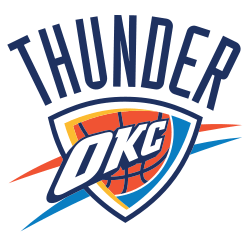
The Oklahoma City Thunder unveiled their first logo on September 3, 2008. The logo is a large blue and yellow banner with the logo in the middle with the wordmark “OKC,” and splashes of yellow at the top and reddish-orange at the bottom. On top is the wordmark “THUNDER.”
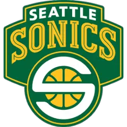
Seattle Supersonics
2002 - 2008
The final Supersonics logo is a white colored "S" representing Seattle and Sonics written on a yellow basketball. The "S" is shaped to be circular to cover the ball. The logo is written on a green background, representing the team colors. On top is the wordmark "SEATTLE" in white and "SONICS" in yellow with a green line throughout.
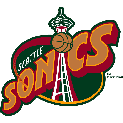
Seattle Supersonics
1996 - 2002
The Space Needle is forming the "I" in the wordmark SONICS" on a brown with orange trim and bold font. All of this on a green oval background with red and orange trim and a basketball for the dot in the "I." Also, a wordmark "SEATTLE" in white above Sonics.
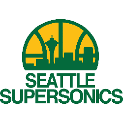
Seattle Supersonics
1976 - 1996
In 1976 the Sonics added a new color to the logo, yellow. The logo featured a basketball with the Seattle cityscape, including the space needle on a yellow background. Below is a wordmark "SEATTLE SUPERSONICS" in green.
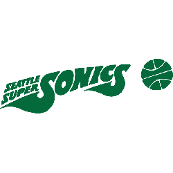
Seattle Supersonics
1972 - 1976
The next Sonic logo again all in green, with a basketball to the right. The wordmark "SONICS" is shaped like a space ship flying with the wordmark "SEATTLE SUPER" above the first "S" in Sonics.
Seattle Supersonics
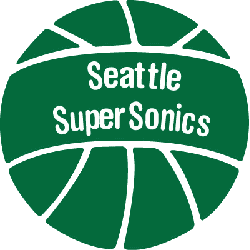
1971 - 1972
In 1971 the Sonics logo changed to a green basketball with a white outline. A wordmark "Seattle SuperSonics" in the center of the basketball in white lettering.
Seattle Supersonics
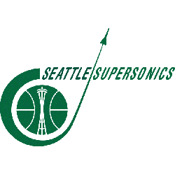
1968 - 1971
The original SuperSonics logo is an all green logo. The space needle is inside a basketball with a Sonic shuttle flying around the basketball. A wordmark "SEATTLE SUPERSONICS" in green.
The Journey of the Oklahoma City Thunder Logo
The Oklahoma City Thunder logo history began in 2008 when the team moved from Seattle. First, they chose a shield with a basketball. Then, vibrant blue and orange hues emerged because fans wanted energy. Now, it’s a bold symbol. Visit the NBA Thunder page for team details. The Oklahoma City Thunder logo captures the city’s spirit.
Basketball Sports Fan Products
